Every Man Dies Alone
The graphic design of this book was inspired by the warning given by Hans Fallada in the introductory note to the work saying that was a text of dark content and that it is important that it was not otherwise. Thus, the graphic choices were made with the intention of honoring the author's wish. There is no color in this book.
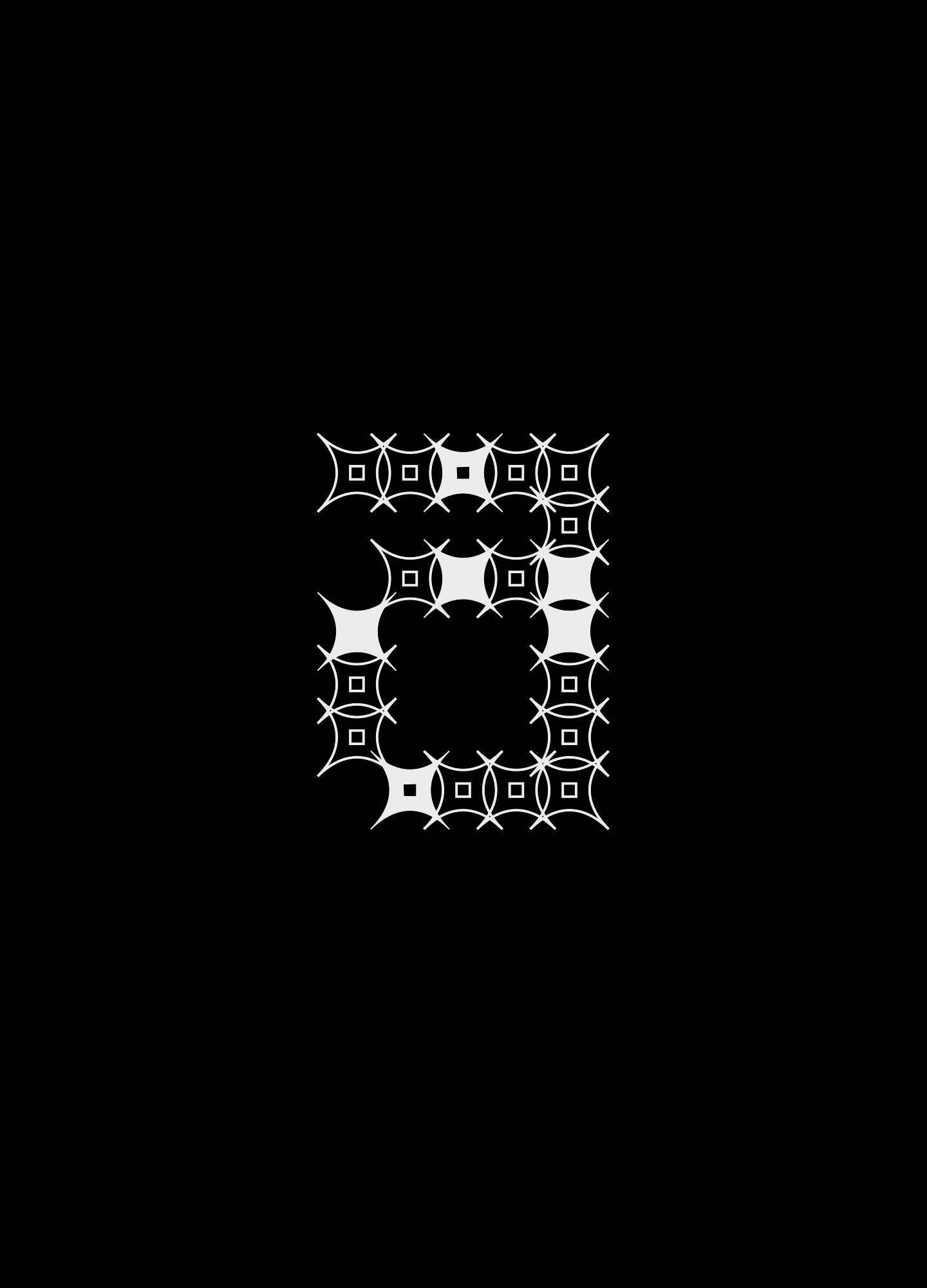
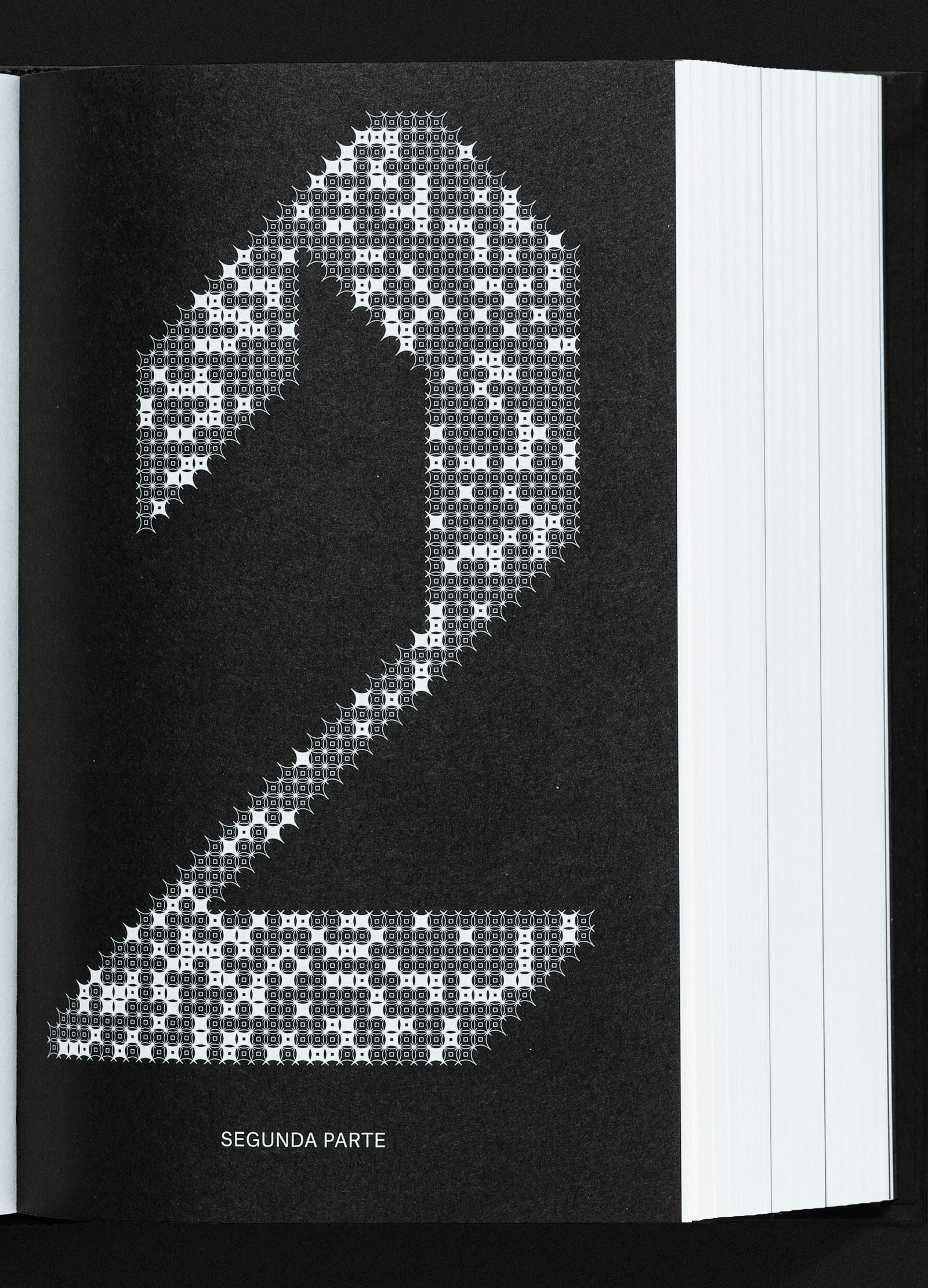
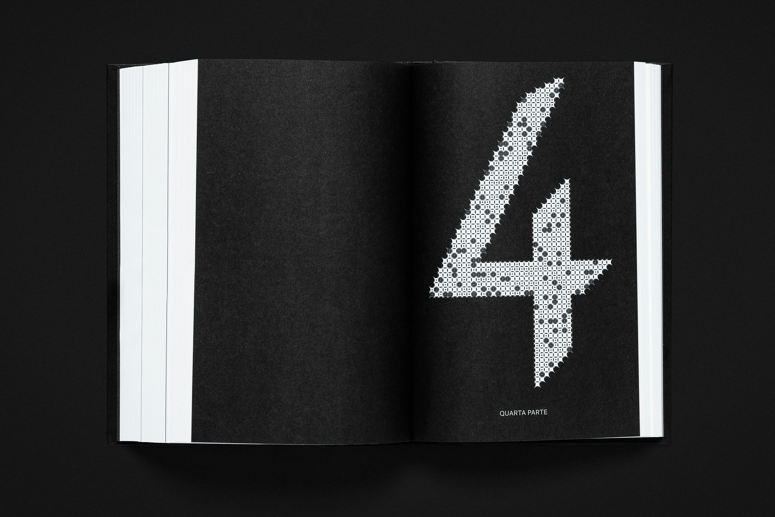
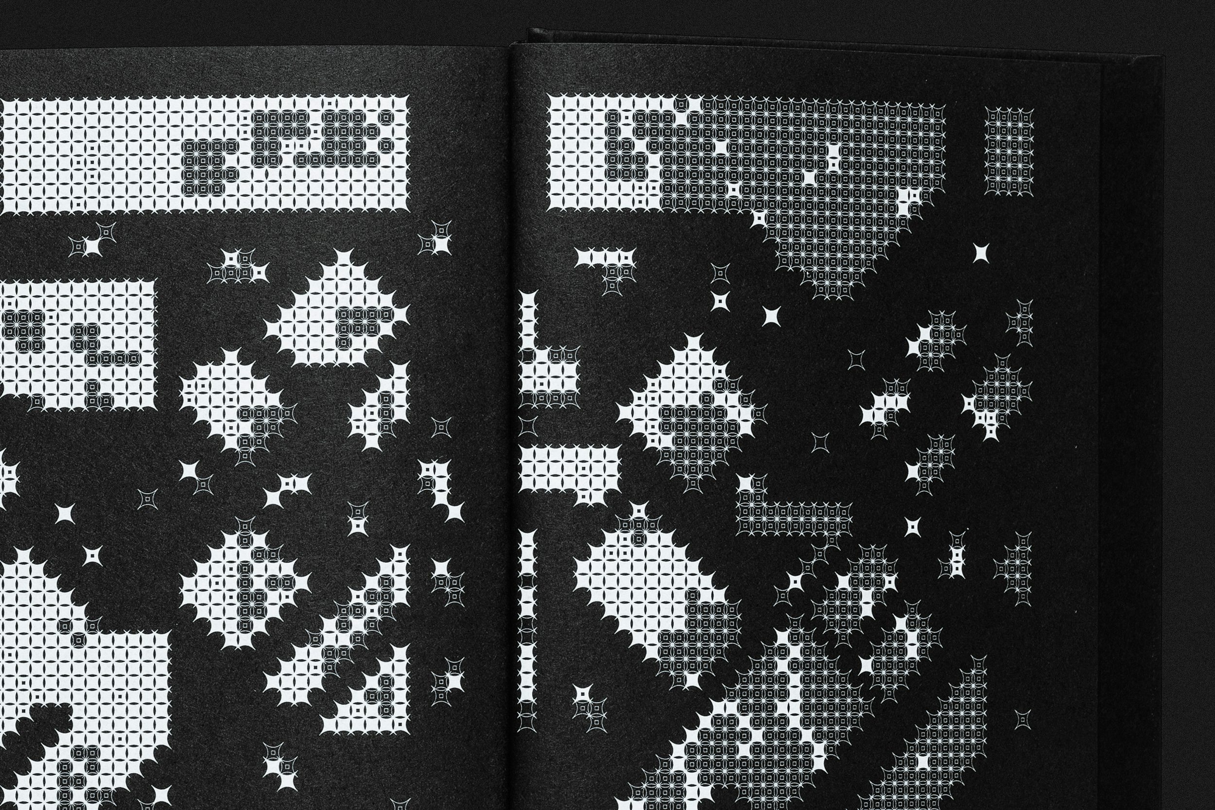
Of the three typefaces that make up the book, two have a German origin: Lyon Text, designed by German Kai Bernau, and Atlas Grotesk, also by Bernau (in partnership with Susana Carvalho and Christian Schwartz). Used on the cover and at the beginning of the four parts of the work, Dorn Display was designed exclusively for the project and was based on the angle of fraktur types, commonly used in Germany during the Hitler regime. Dorn, “thorn” in German, refers to the sharp vertices of the constructive unit modules of typography. The same modules, which vary in the filling of their core, gave rise to the illustrations that open and close the book, based on maps of the city of Berlin.
Credits
POLAR TEAM
Creative Direction: Bruno Ribeiro, Ralph Mayer Design: Bruno Ribeiro, Estela Mendes, Matheus Sakita, Ralph Mayer Illustrations: Estela Mendes Case Study Photography: Bruno Ribeiro, Matheus Sakita, Ronaldo Arthur Vidal
CARAMBAIA TEAM
Editorial Director: Fabiano Curi Editor-in-chief: Graziella Beting Editor: Ana Lima Cecilio Art Editor: Laura Latufo Editor Assistant: Kaio Cassio Print Production: Lilia Góes Book Photography: Nino Andrés
BOOK DETAILS
Cada um morre por si / Hans Fallada; Original title: Jeder stirbt für sich allein (Berlin, 1947) Translated by: Sonali Bertuol Text Preparation: Tamara Sender Proofreading: Ricardo Jensen de Oliveira, Cecilia Floresta
COLOPHON
Size: 130×210 mm Paper: Popset Extra Black, Munken Print Cream 80 g/m2 Printing: Offset, Silkscreen
TYPEFACES
Dorn Display (Polar, Ltda.) Atlas Grotesk (Carvalho Bernau) Lyon Text (Carvalho Bernau)
ACKNOWLEDGEMENTS
Latin American Design Awards (bronze)