Neon
Founded in 2016, Neon was one of the first Brazilian fintechs focused on digital checking accounts and credit cards. Four years later, Neon asked Polar to rethink the brand's visual strategy and the way it expressed itself in its touchpoints. The proposal, which emerged from a work process that included the design and brand experience teams, emphasizes Neon's strategic platform: giving out power in people's hands.
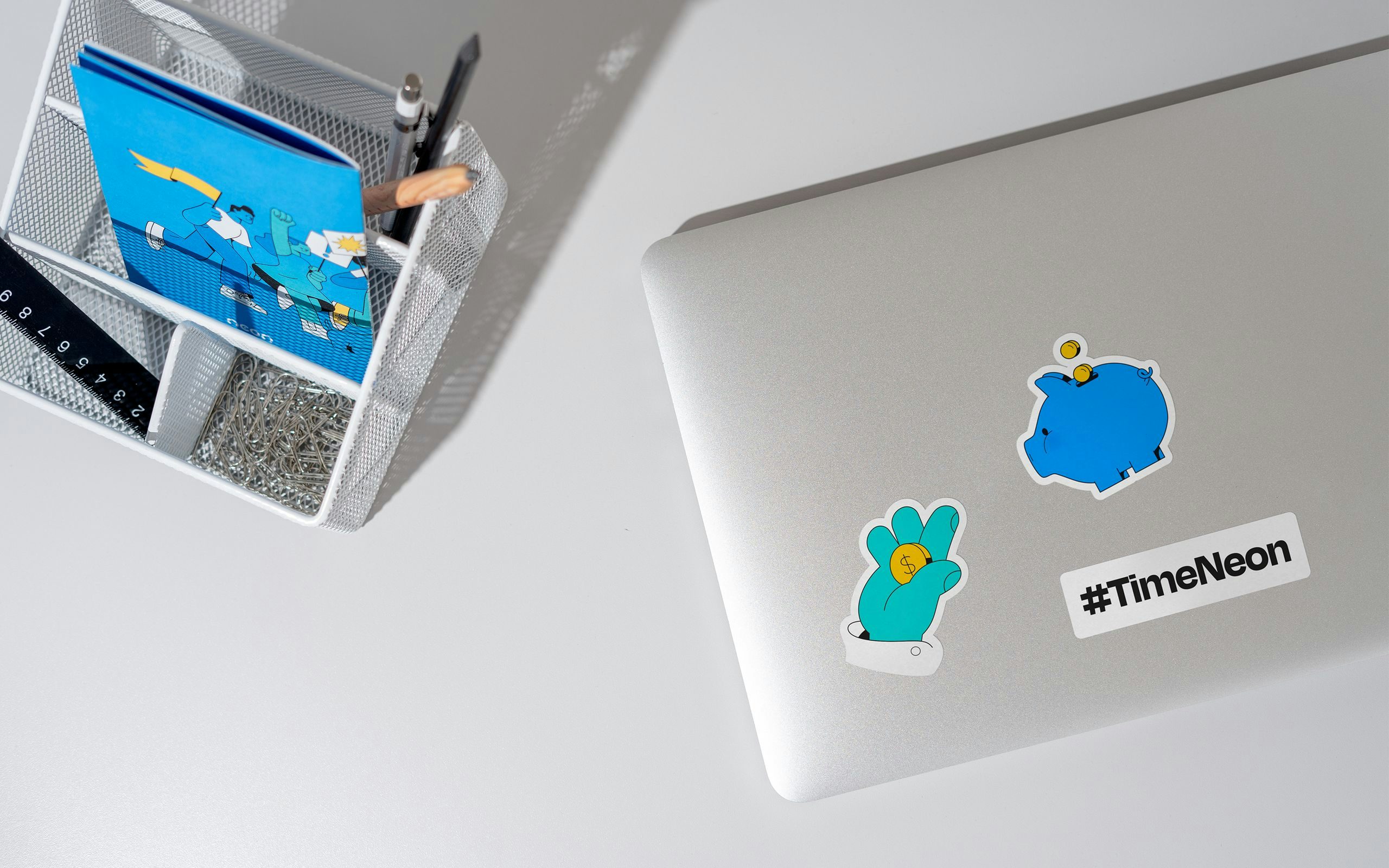
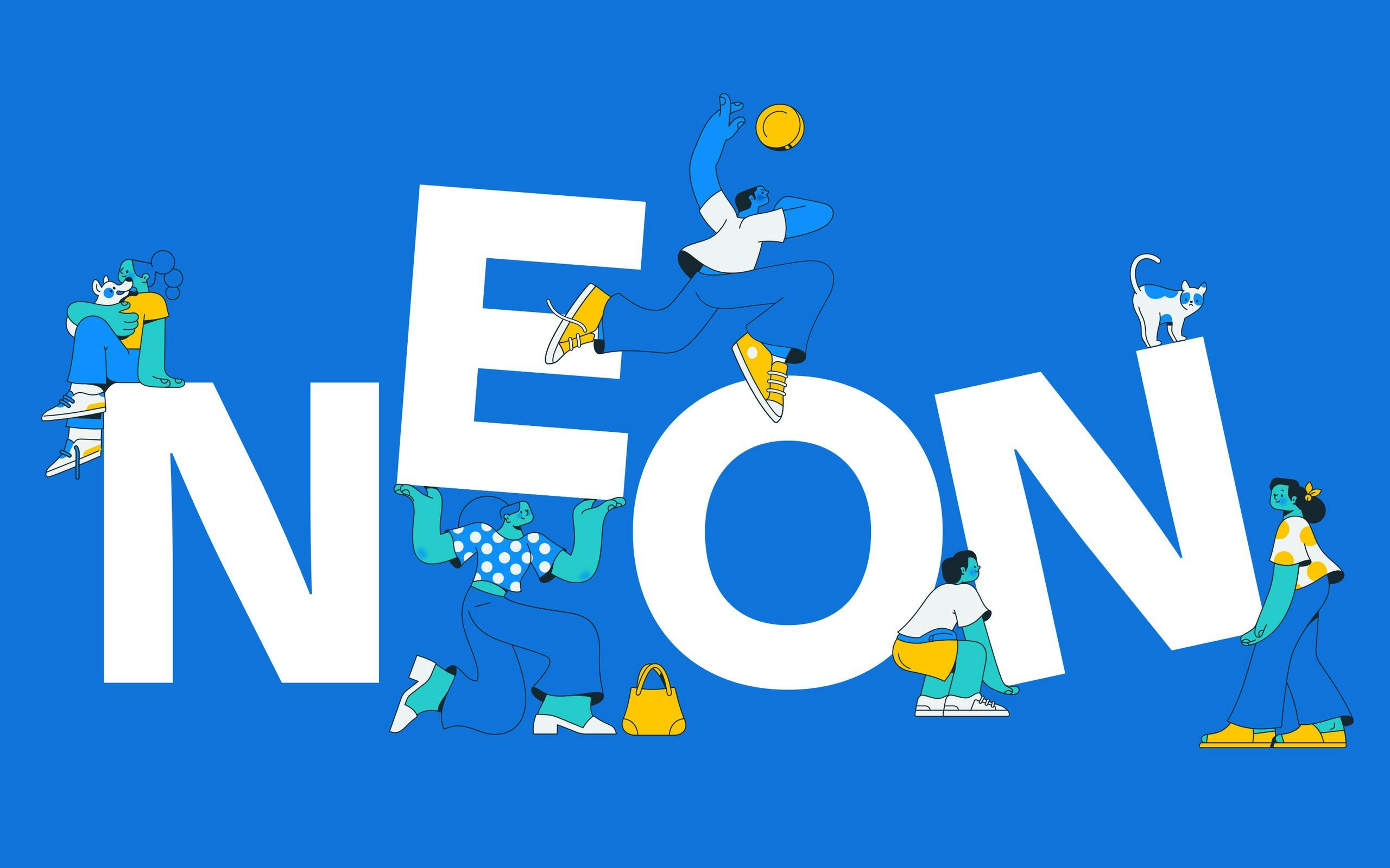
The visual system was designed to reflect customer empowerment across all touchpoints, from institutional communications to the full-scale digital ecosystem. Its construction is based on three pillars: the first one is the colors, which enhance the territory already conquered by the brand's gradient. Second, the typographic pairing, which brings strength to institutional communications without sacrificing functionality in digital products. The third pillar is the illustrations (created by Estúdio Passeio), which bring the necessary differentiation to take the brand one step further.
In addition to the design of the brand's entire graphic package, the visual reasoning was expanded to the kinetic field, translating Neon's strategy and values into parameters and directions of time, pace and acceleration. The result is an animation guide that presents conceptual and technical guidelines that should permeate any piece of communication that is in motion.
Credits
POLAR TEAM
Creative Direction: Lais Ikoma, Ralph Mayer, Ronaldo Arthur Vidal Design: Estela Mendes, Lais Ikoma, Ralph Mayer, Ronaldo Arthur Vidal Motion Design: Luciana Mayume, Ronaldo Arthur Vidal Case Study Photography: Lais Ikoma, Ronaldo Arthur Vidal
NEON TEAM
Alexandre Alvares, Bruno Chung, Danilo Lima, Michel Farah
COLLABORATIONS
Illustrations: Estúdio Passeio 3D: Rafael Eifler
TYPEFACES
Degular Display (OH no Type Company) Inter (Rasmus Andersson)
SCOPE
Visual Identity Creative Direction Motion Design Design System
ACKNOWLEDGEMENTS
Behance (featured in Branding gallery)