Rita Saúde
Rita is a digital health solution whose mission is to simplify the relationship between patients and health professionals. The company, which borrows its name from Rita Lobato Velho Lopes, the first female doctor with a degree in medicine in Brazil, aims to bridge the gap between quality healthcare and low-income patients, offering services with the support of the Sabin network.
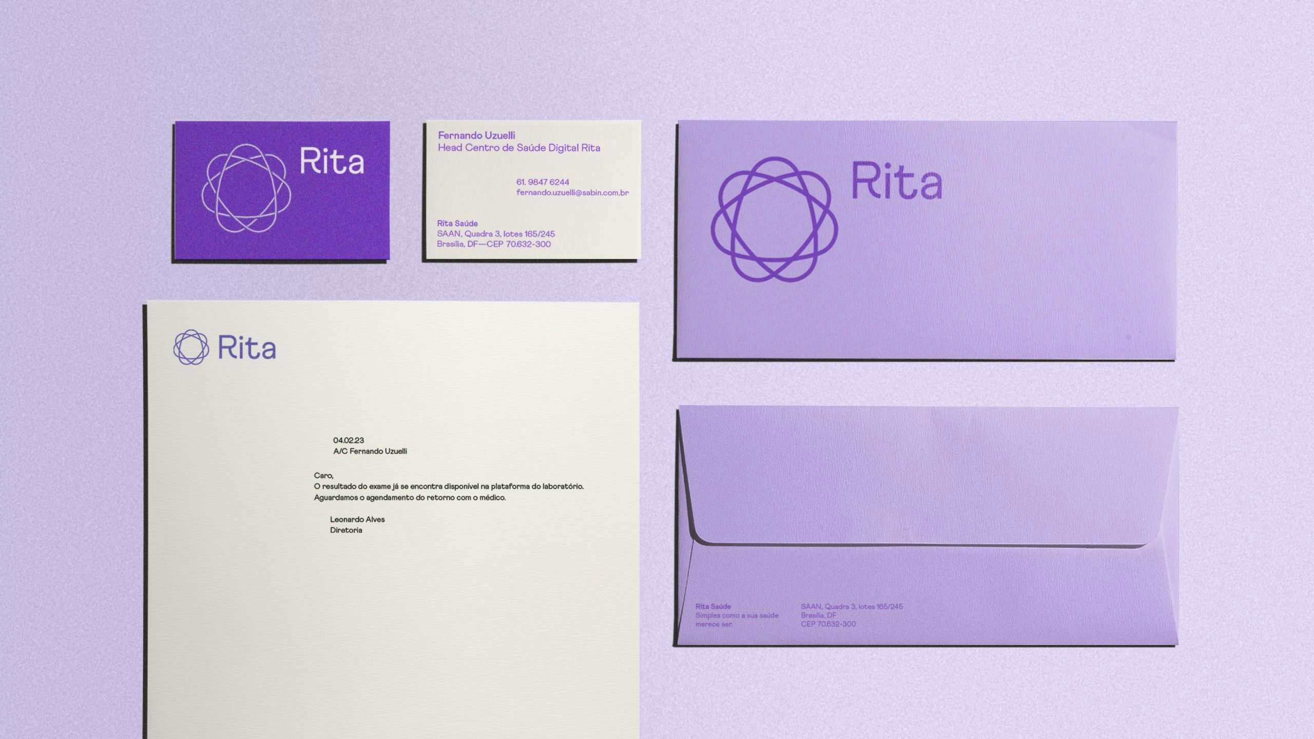
As one of the first digital native companies in the segment, the chromatic palette is designed for use on screens, but relies on calming and comforting colors. The symbol, designed to represent this link between people and health services that Rita seeks to be, is a shape without beginning or end, and reflects the light, organic and constant way that the company sees health care for subscribers.
The same “cyclic” construction logic also gave rise to the brand's proprietary iconography and the graphics that support the construction of the pieces. The same rationale was also applied to the illustration style exercises, which portray the two ends of medical care (patients and health professionals) in a modern and welcoming way.
Credits
POLAR TEAM
Creative Direction: Lais Ikoma, Ralph Mayer Design: Estela Mendes, Bruno Ribeiro, Lais Ikoma, Ralph Mayer, Ronaldo Arthur Vidal Illustration: Stella Bonici Motion Design: Ronaldo Arthur Vidal, Stella Bonici Case Study Production: Stella Bonici
COLLABORATIONS
Brand Strategy: Andreza Spinelli, Conrado Rodrigues Verbal Brand Identity: Ana Guadalupe
RITA TEAM
Fernando Uzuelli, Leonardo Alves
TYPEFACES
Athletics (Family Type)
SCOPE
Branding Visual Identity Illustration Iconography