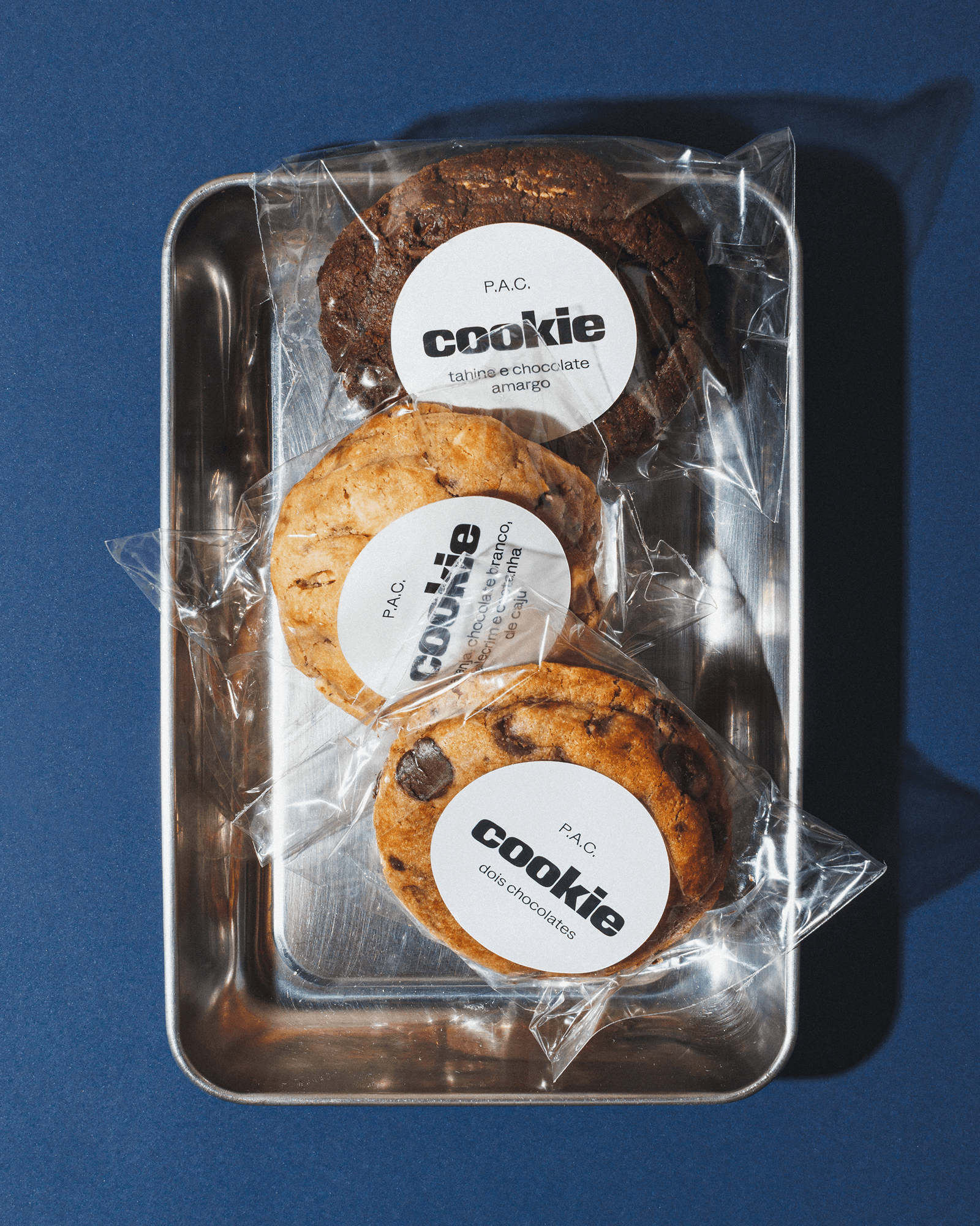
P.A.C.
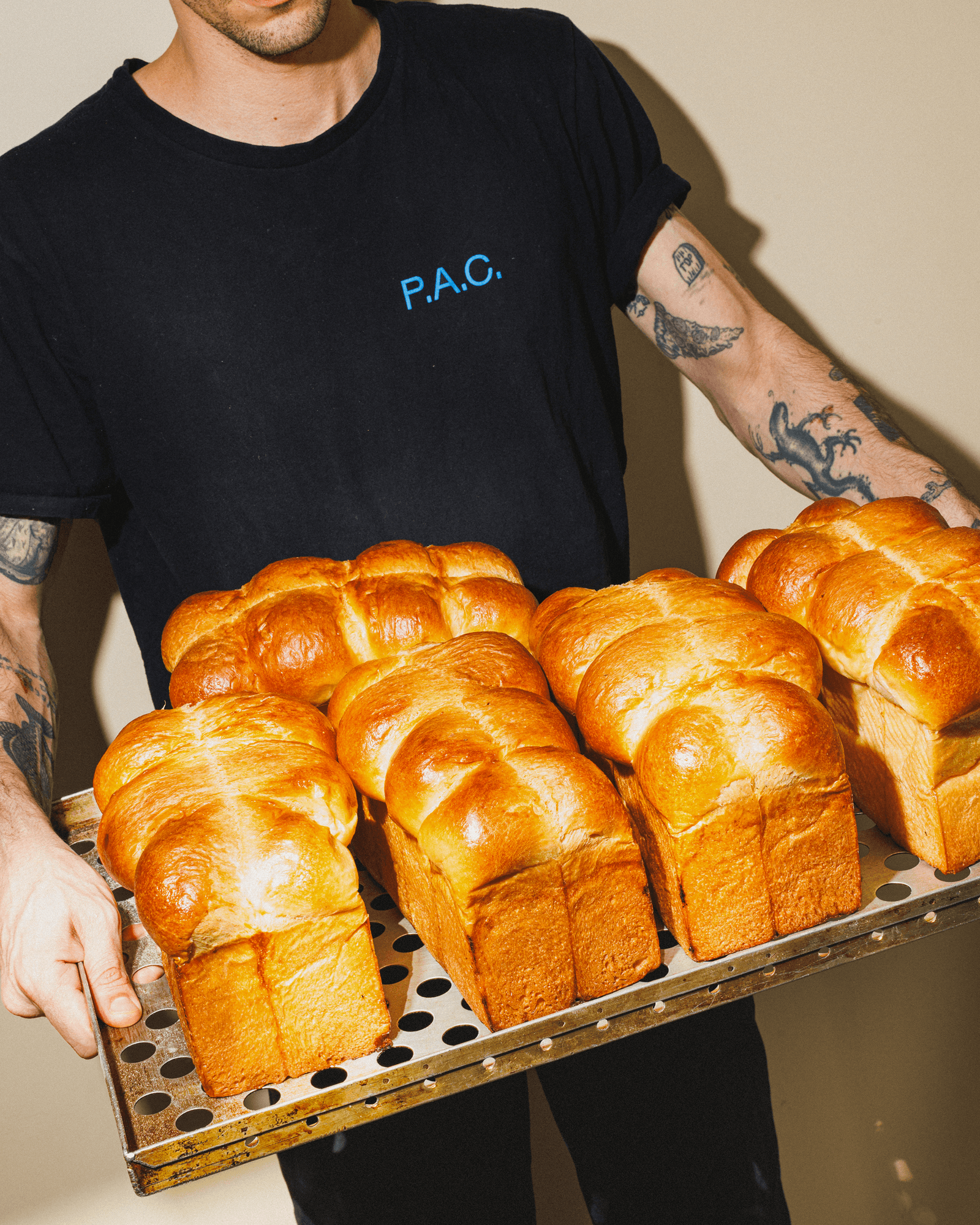
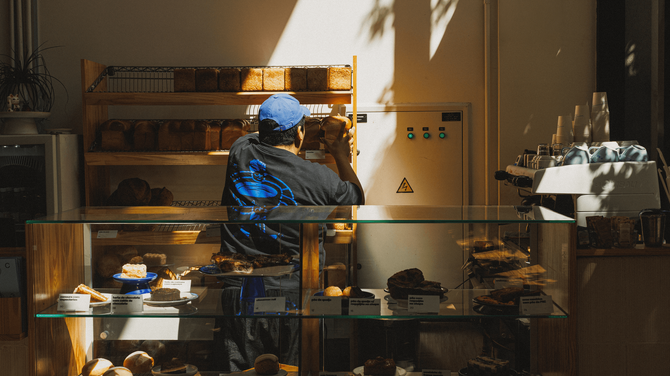
In a way, P.A.C. is a close relative of Polar. Two of the studio’s four partners are also partners in the bakery, while the other two are among P.A.C.’s most devoted regulars. This proximity has made P.A.C. a natural space for experimentation within the studio.
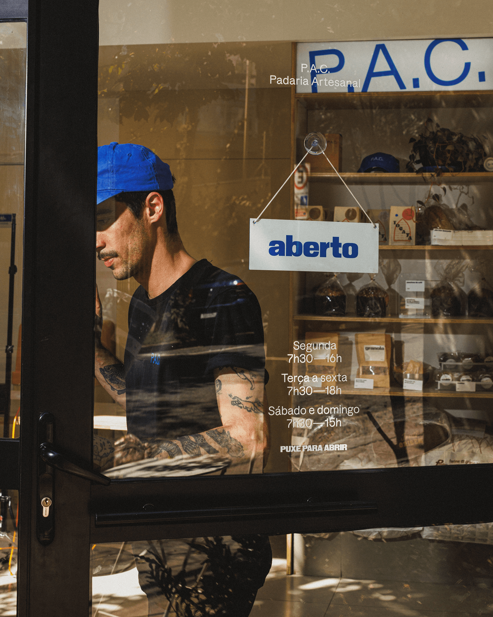
P.A.C. began as an experiment in many senses. The bakery was founded by a small group with no professional kitchen experience, but with a growing obsession with bread, an active sourdough starter, and the desire to turn that obsession into something real. From the beginning, the menu, service, space, and visual language were treated as things that could be questioned, tested, and changed.
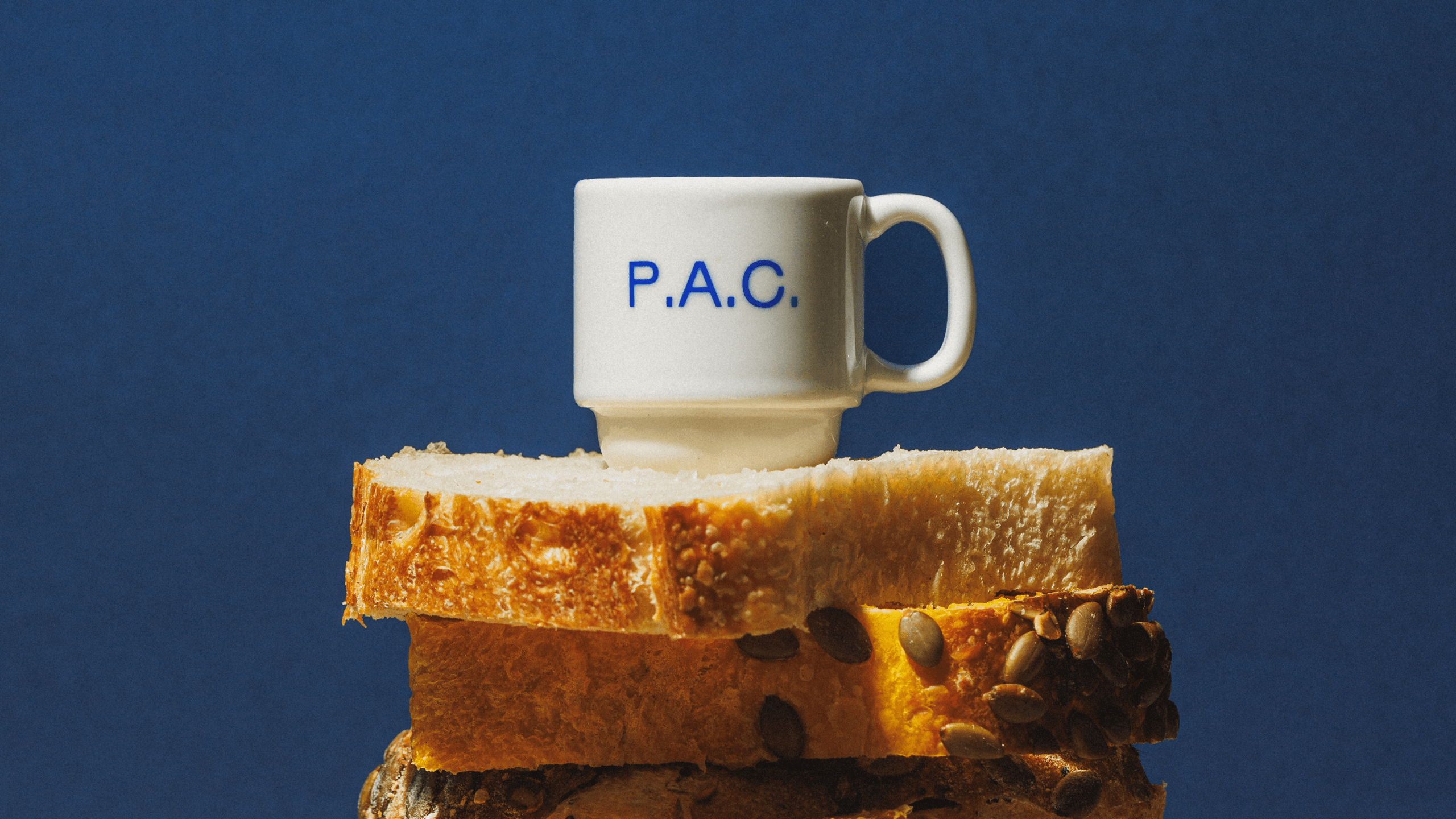
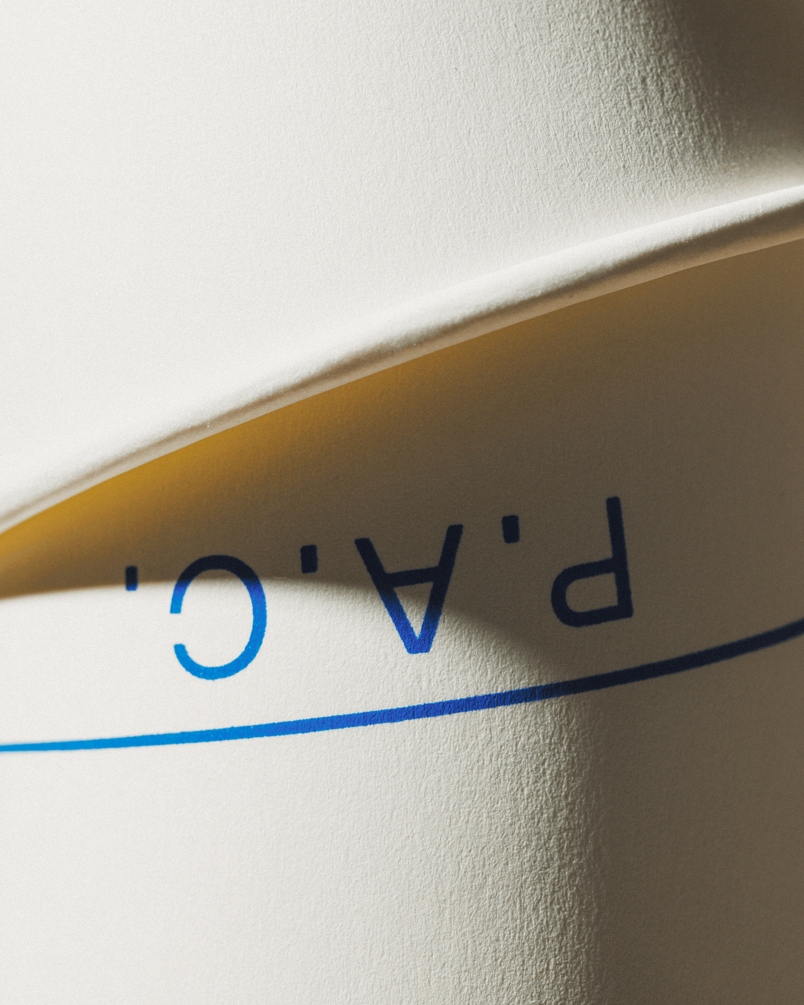
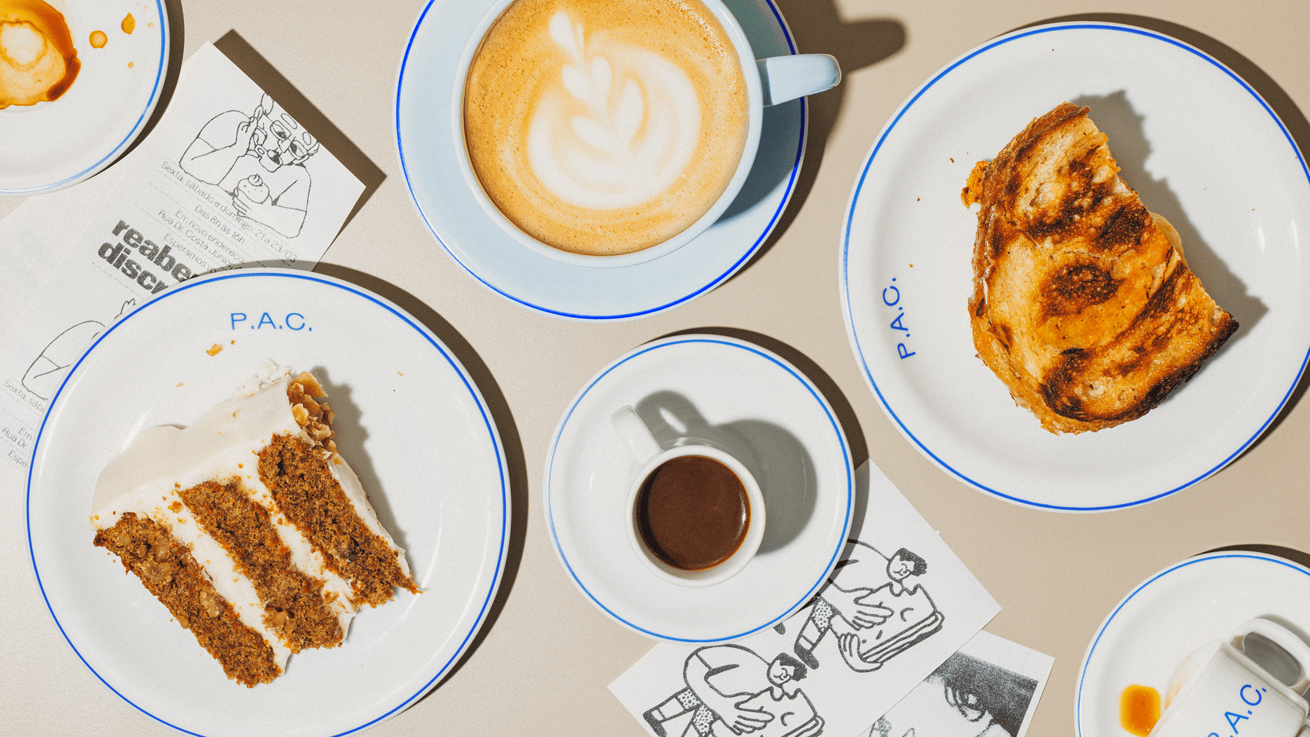
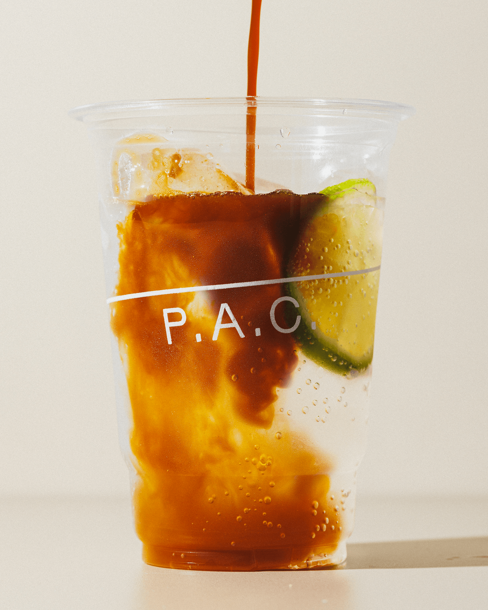
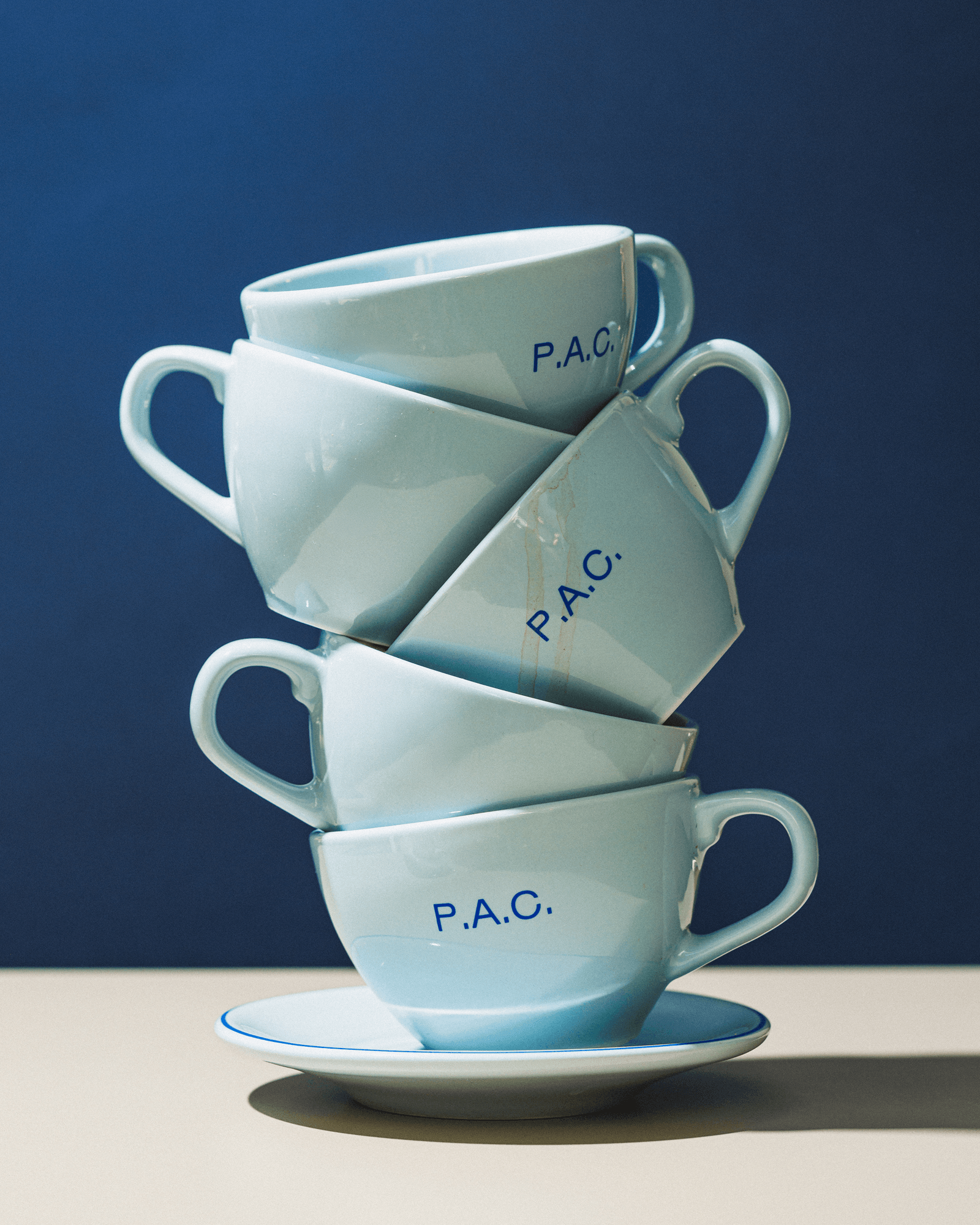
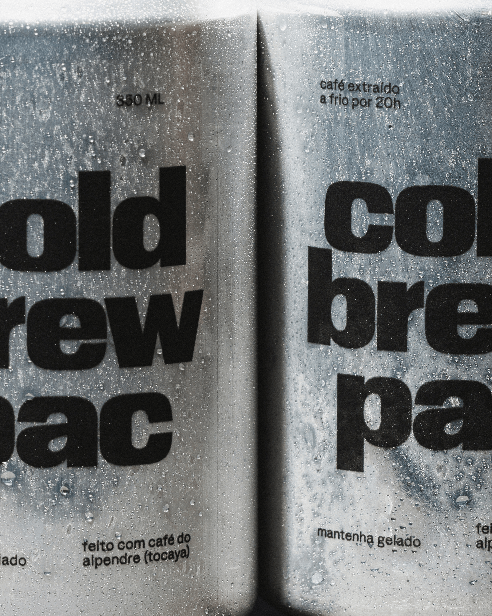
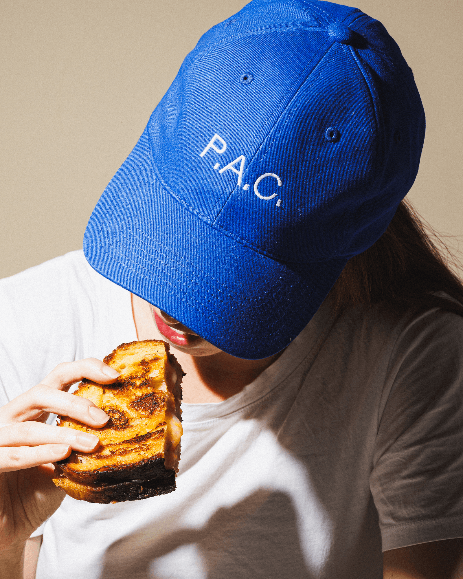
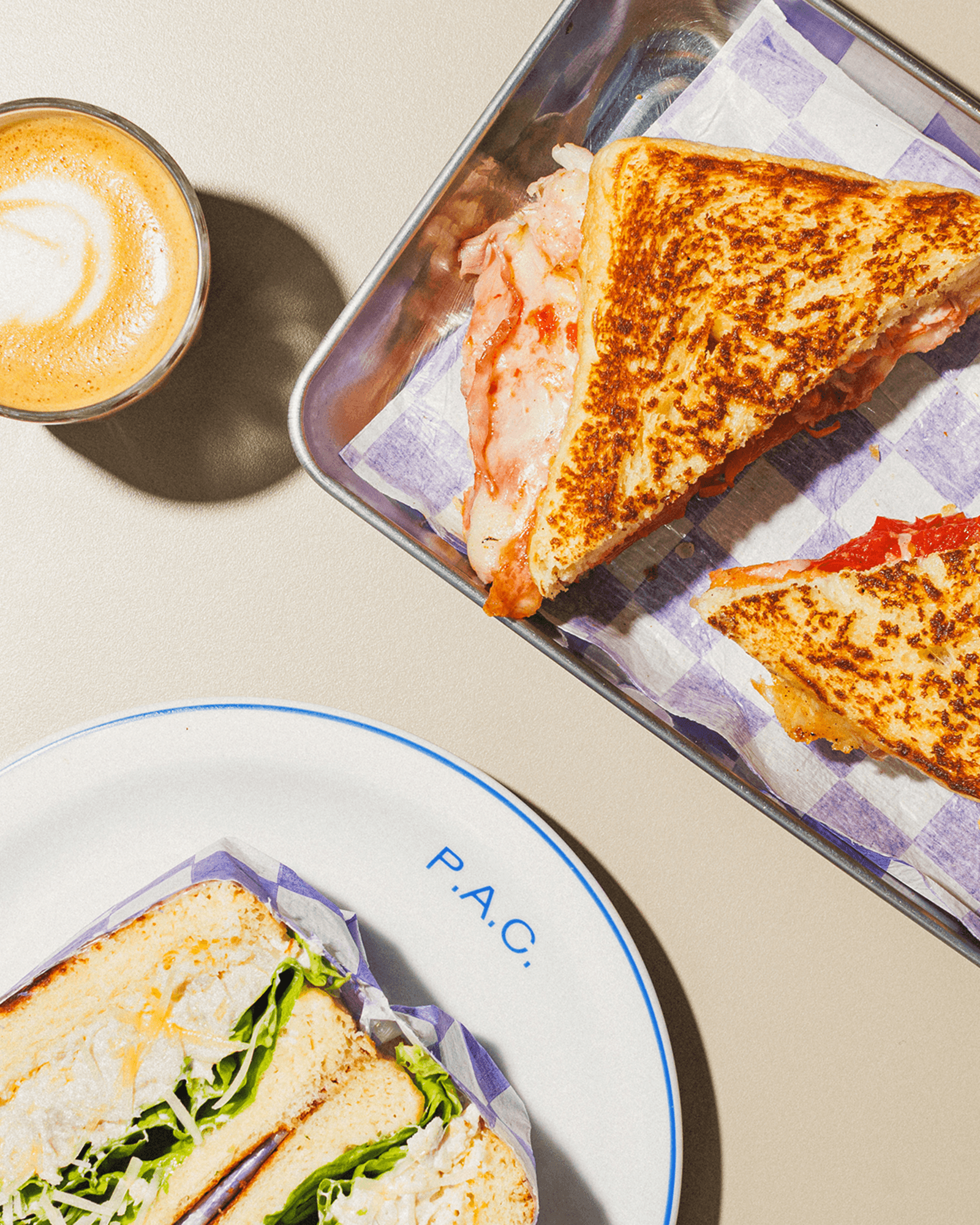
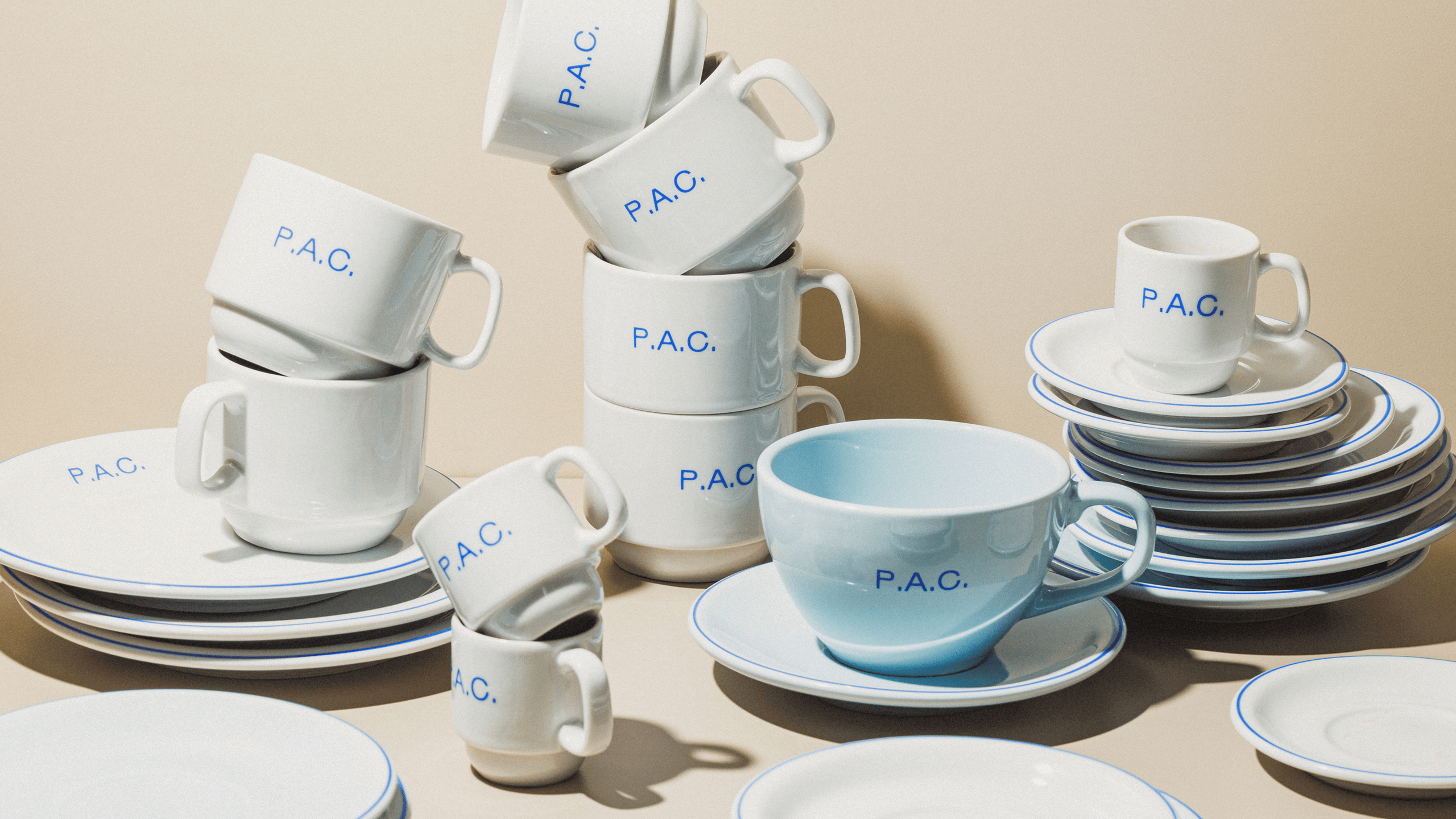
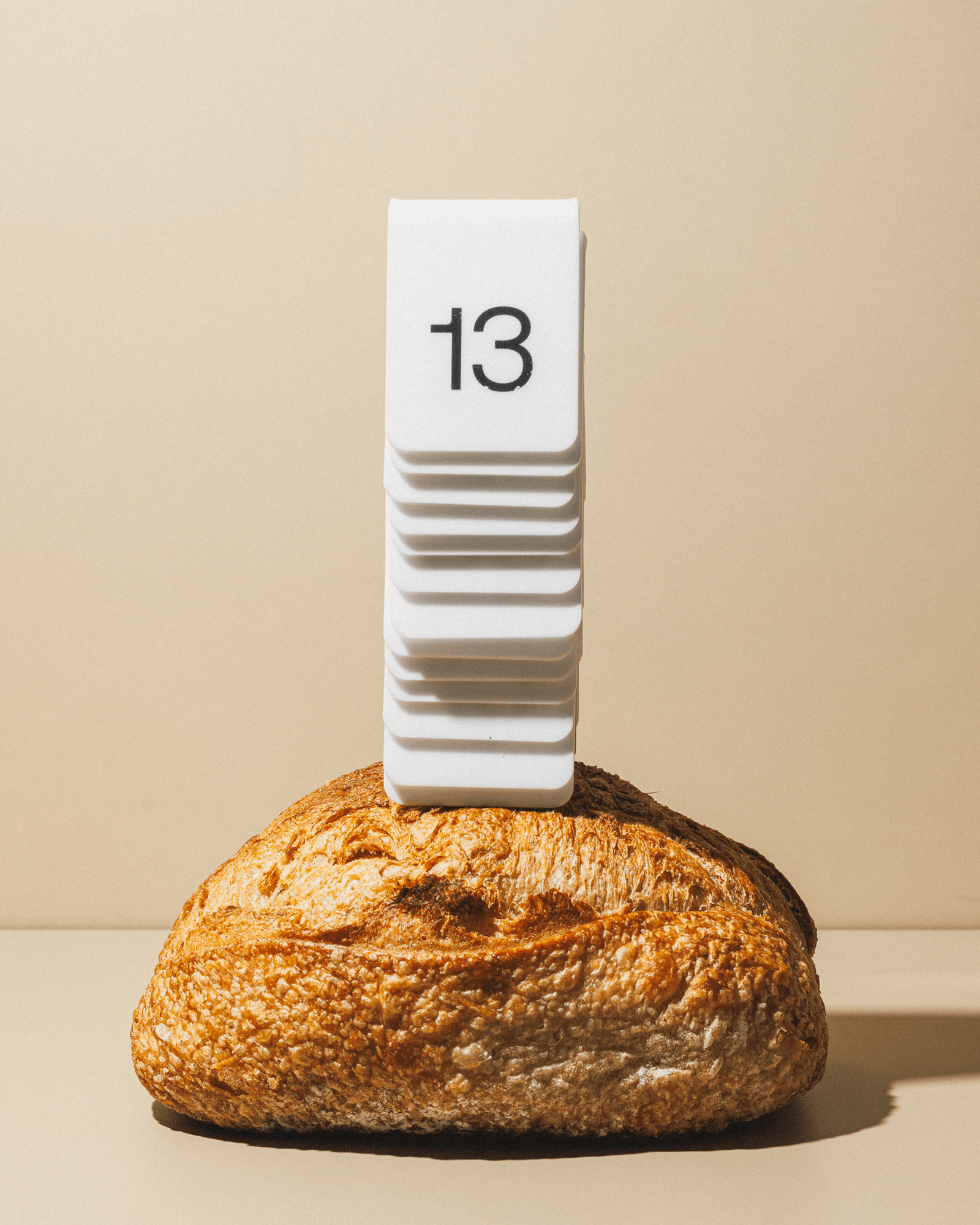
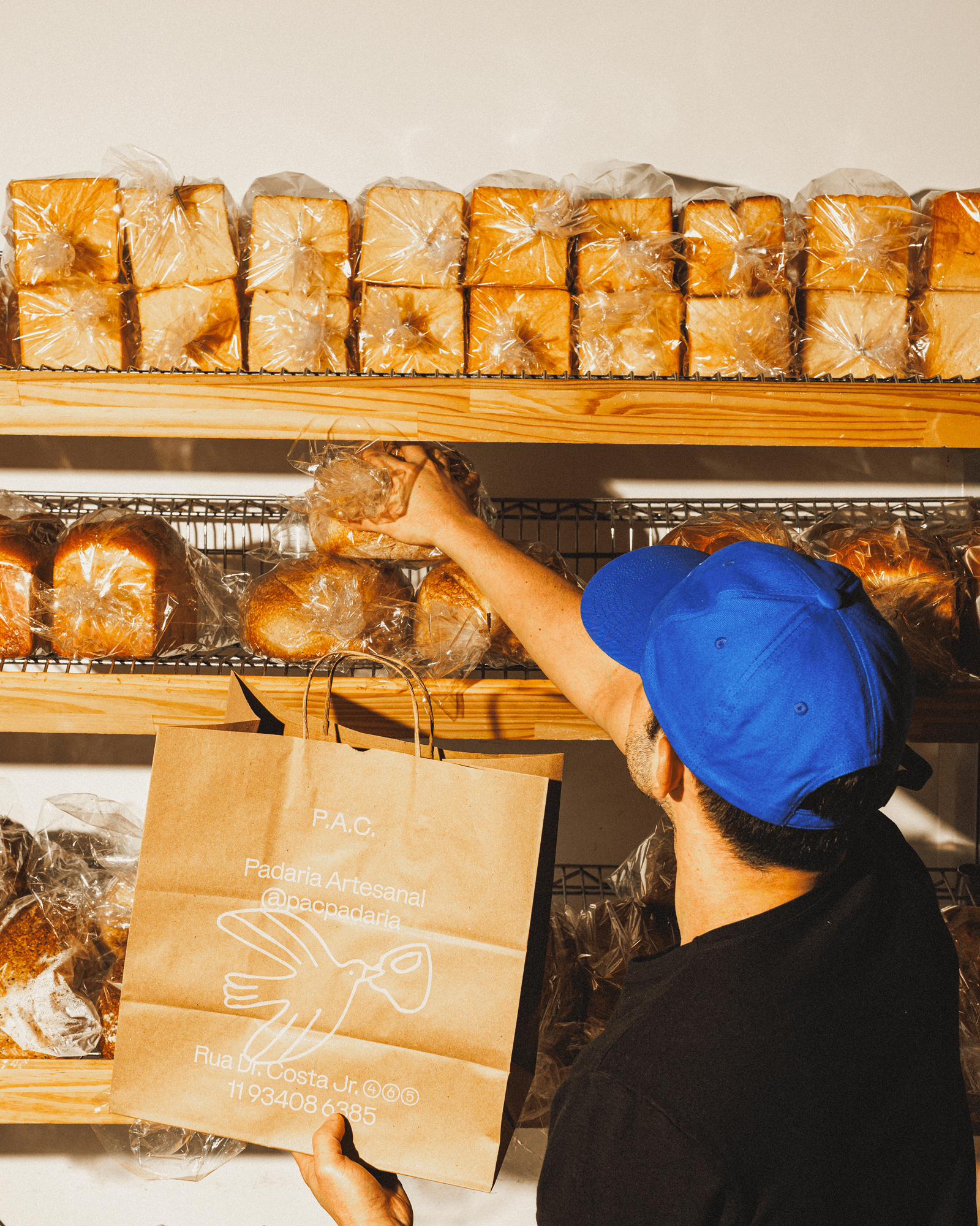
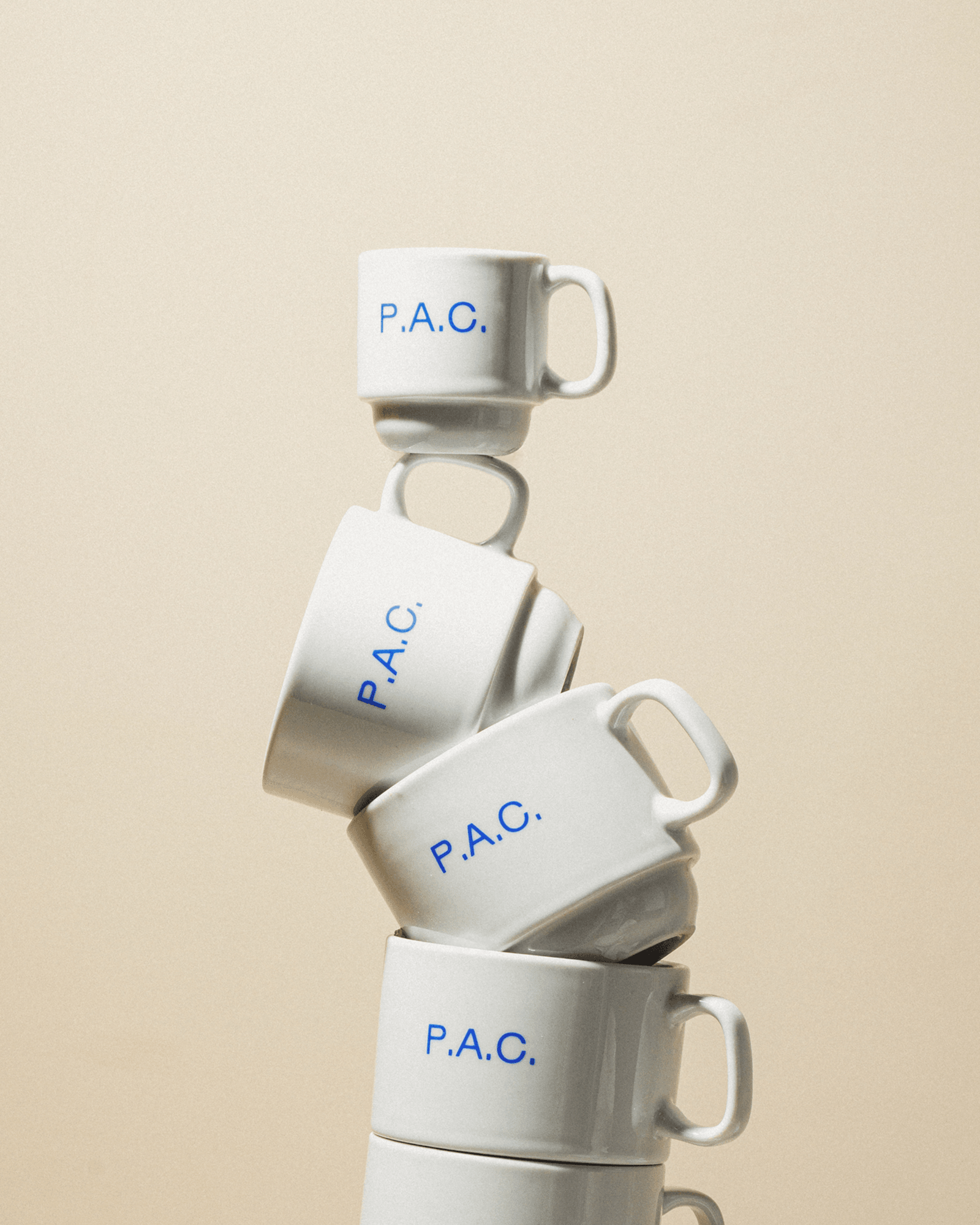
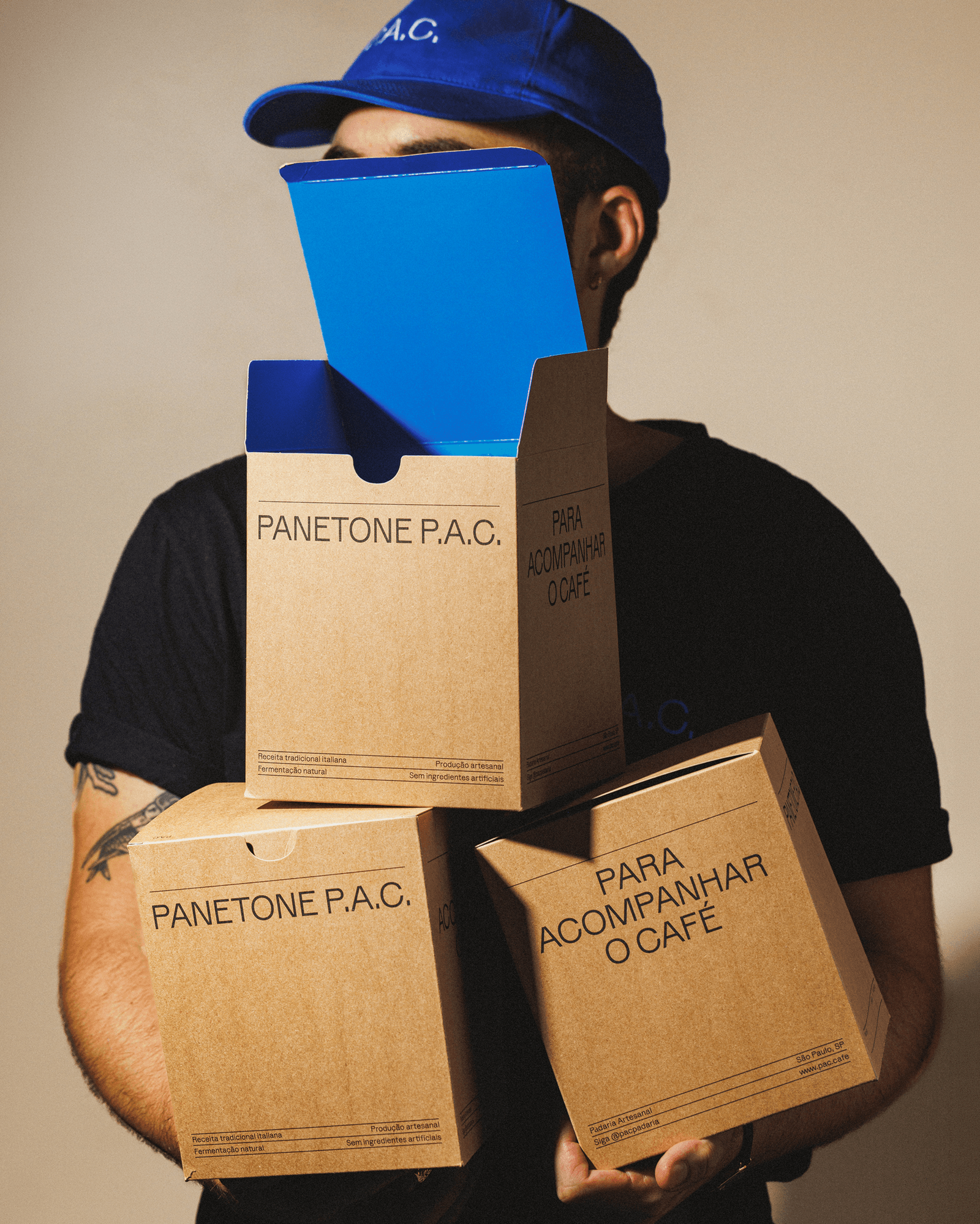
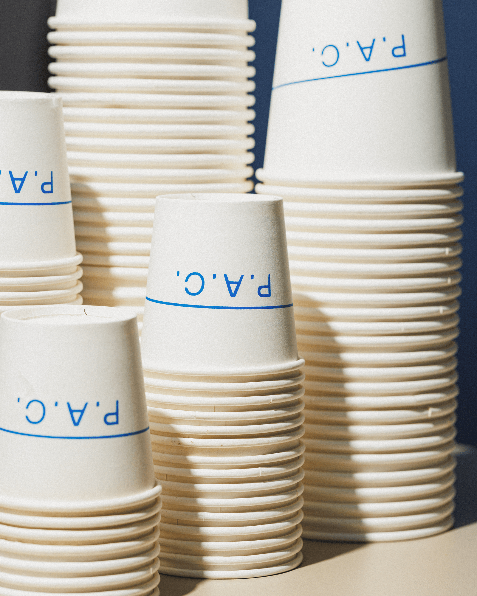
That spirit became an important principle for the identity. Across packaging, ceramics, the space itself, menus, and social media, the same idea remains: rather than building a rigid visual system, Polar developed a recognizable identity, while remaining open to interpretation.
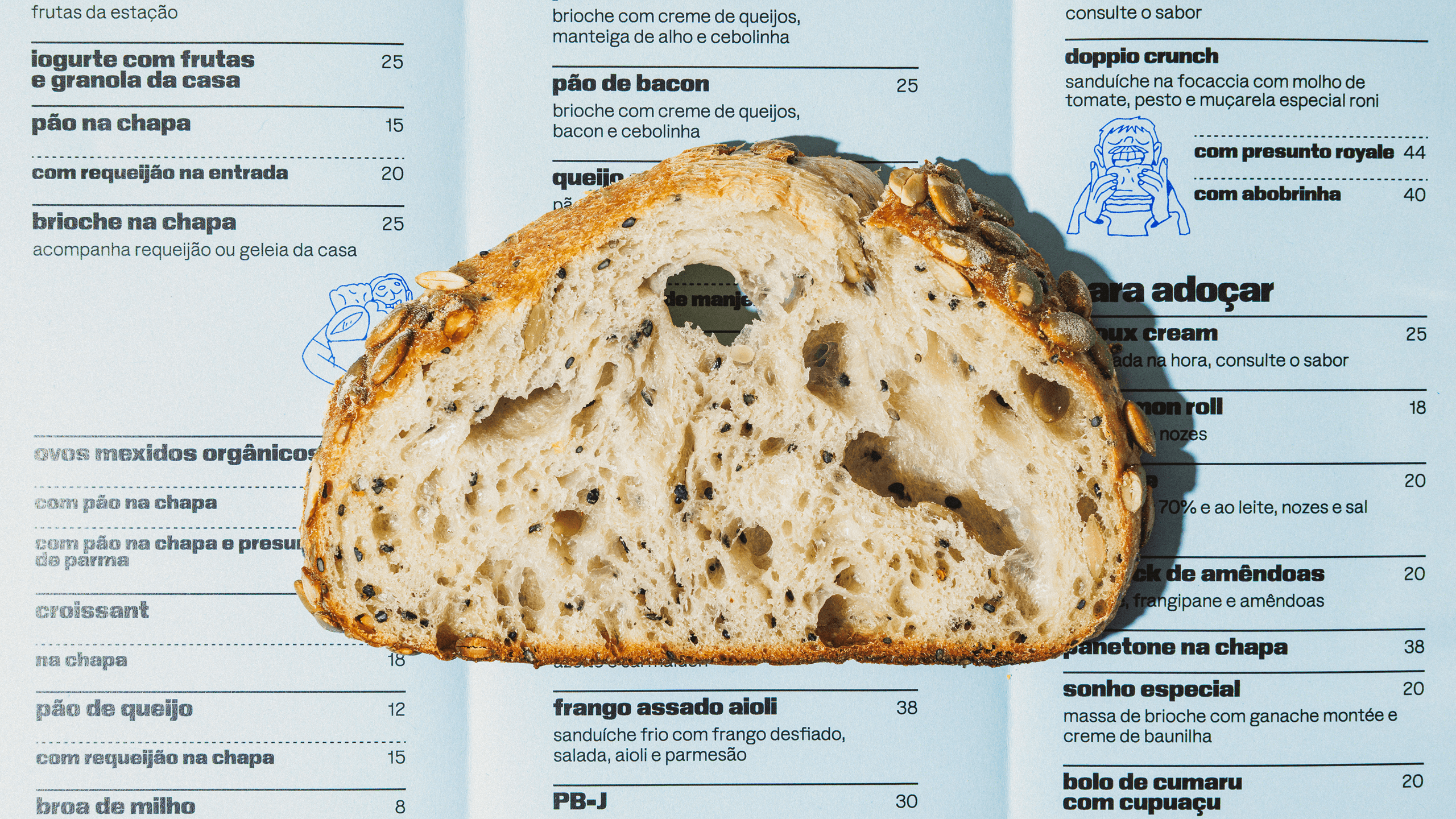
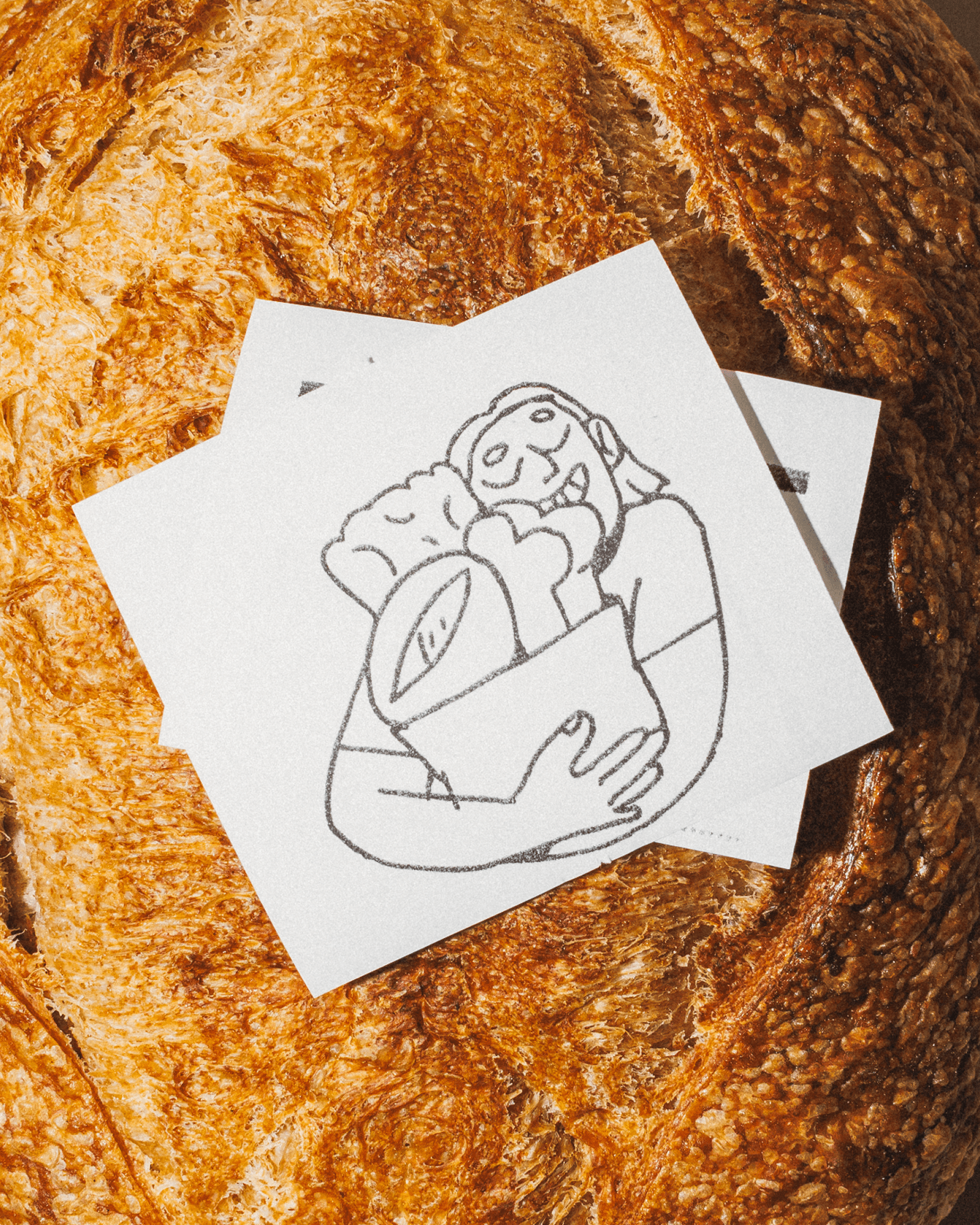
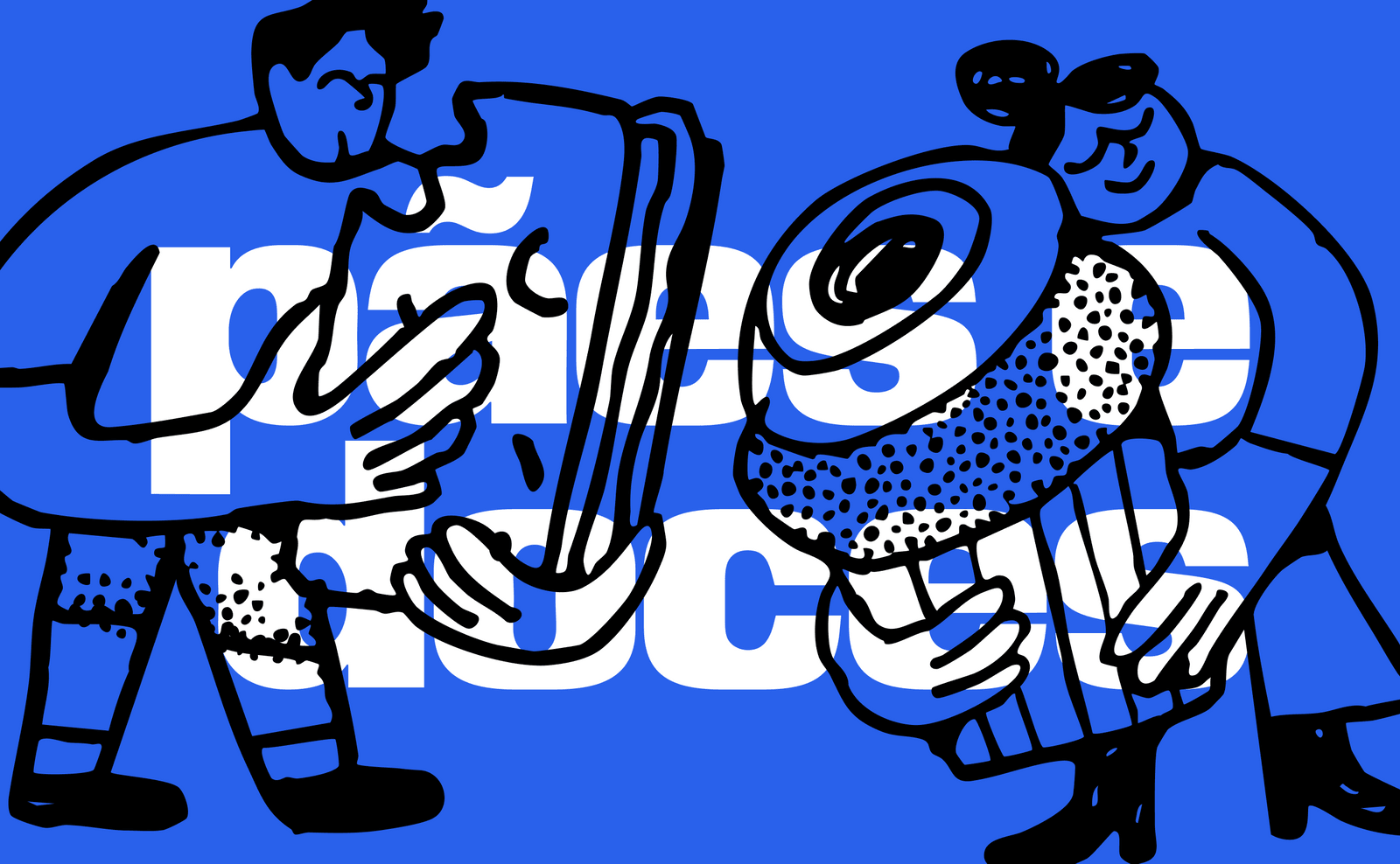
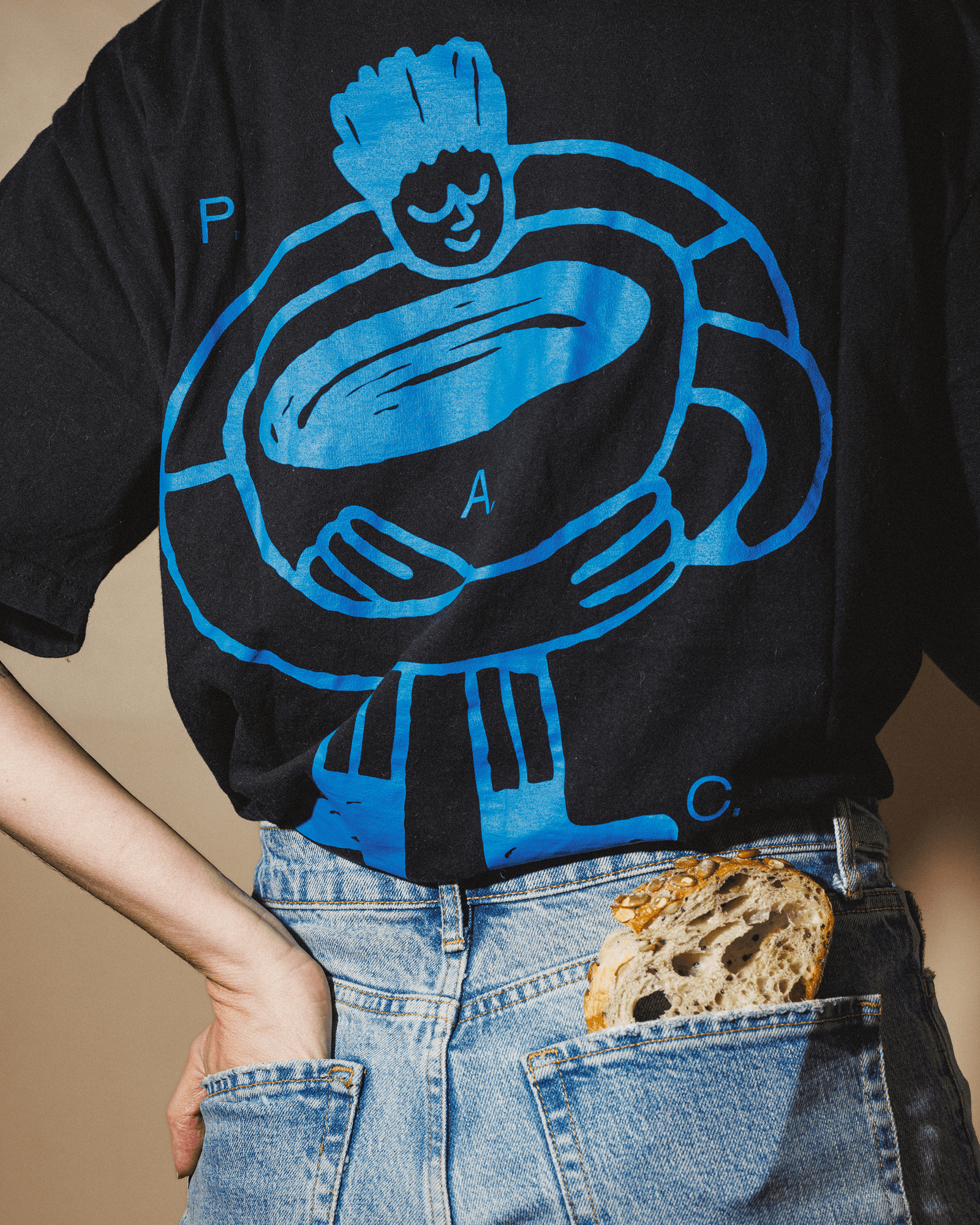
Typography plays a central role, establishing much of the bakery’s visual character, while illustration introduces another layer of expression, sometimes playful and direct, sometimes abstract, dense, or deliberately overbearing. Illustration has become a recurring part of this visual vocabulary and, over the past four years, Polar has worked closely with illustrator Beatriz Batisteli to create a body of work that can move freely from a paper bag to a wall. With her playful linework, Bia captures the general love for the bakery’s treats, drawing inspiration from the community P.A.C. creates: people of different ages, styles, and personalities, brought together by a favorite loaf, an after-lunch coffee, or a special occasion. Rather than functioning as a decorative layer applied on top of the identity, the illustrations keep refreshing the system, allowing each new application to be different from the last.
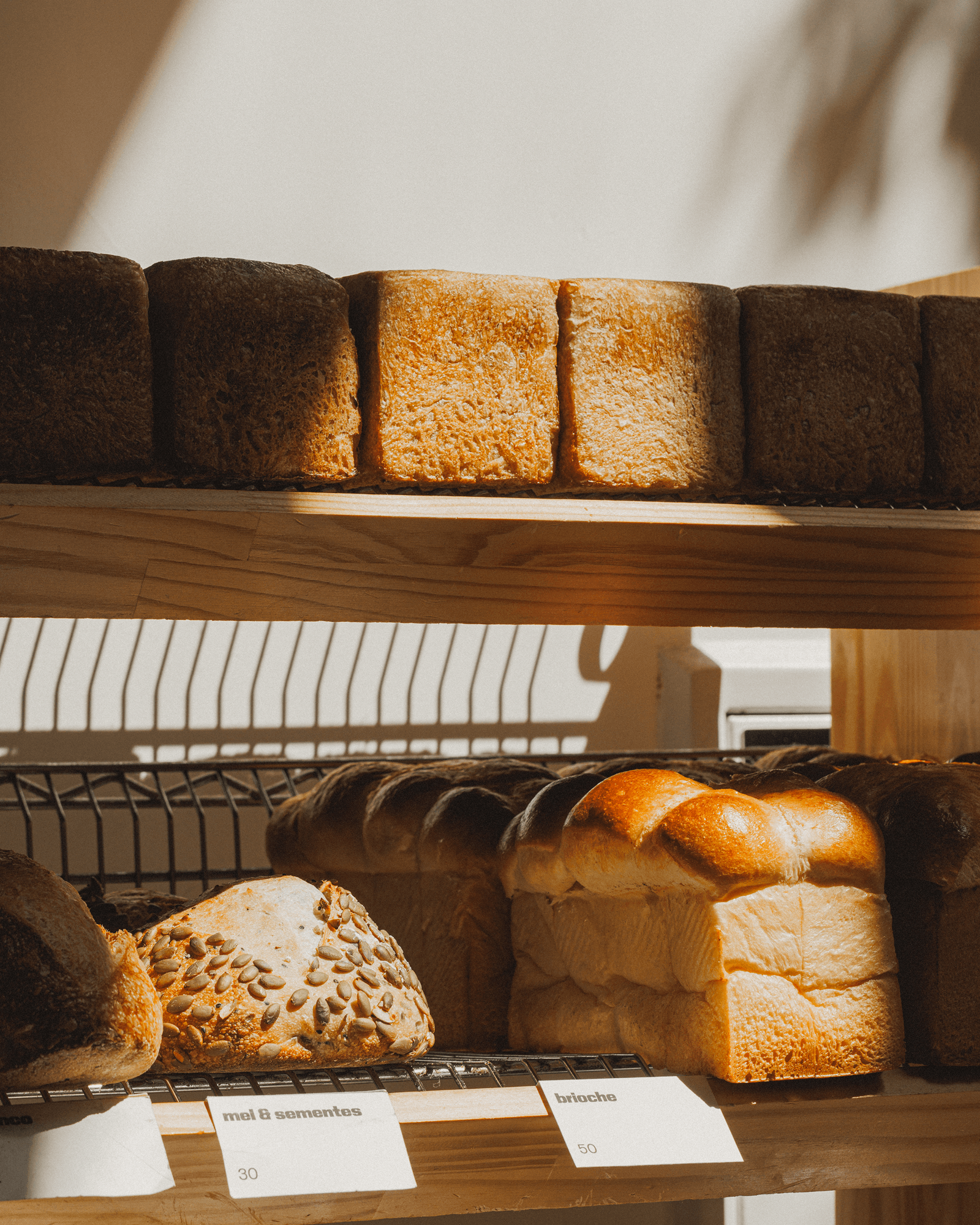
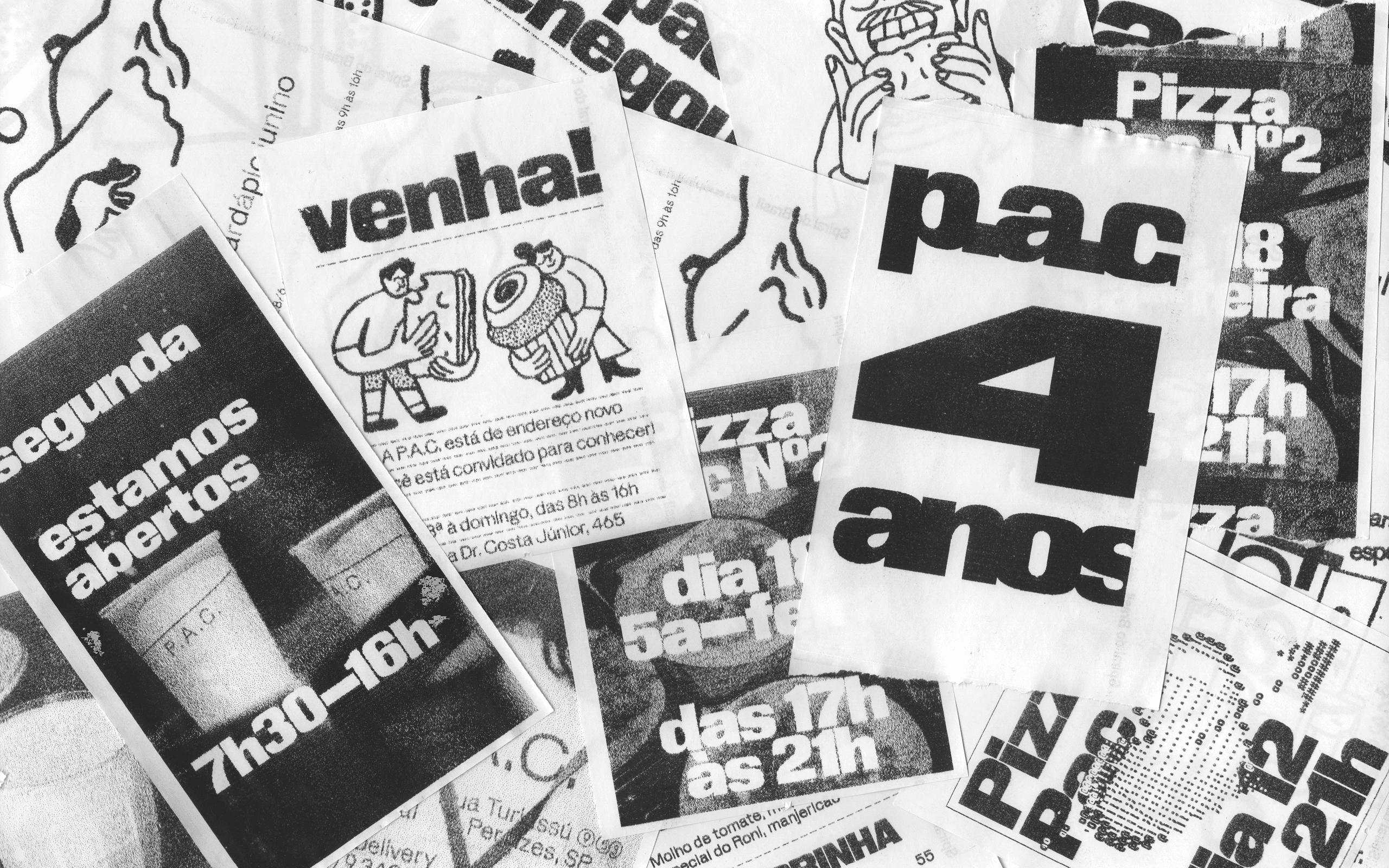
The identity is also comfortable with things that are perishable. P.A.C.’s menu changes constantly, with new breads, pastries, and other products appearing week after week. This created an opportunity to treat communication almost like ephemeral publications, rather than a fixed set of branded assets.
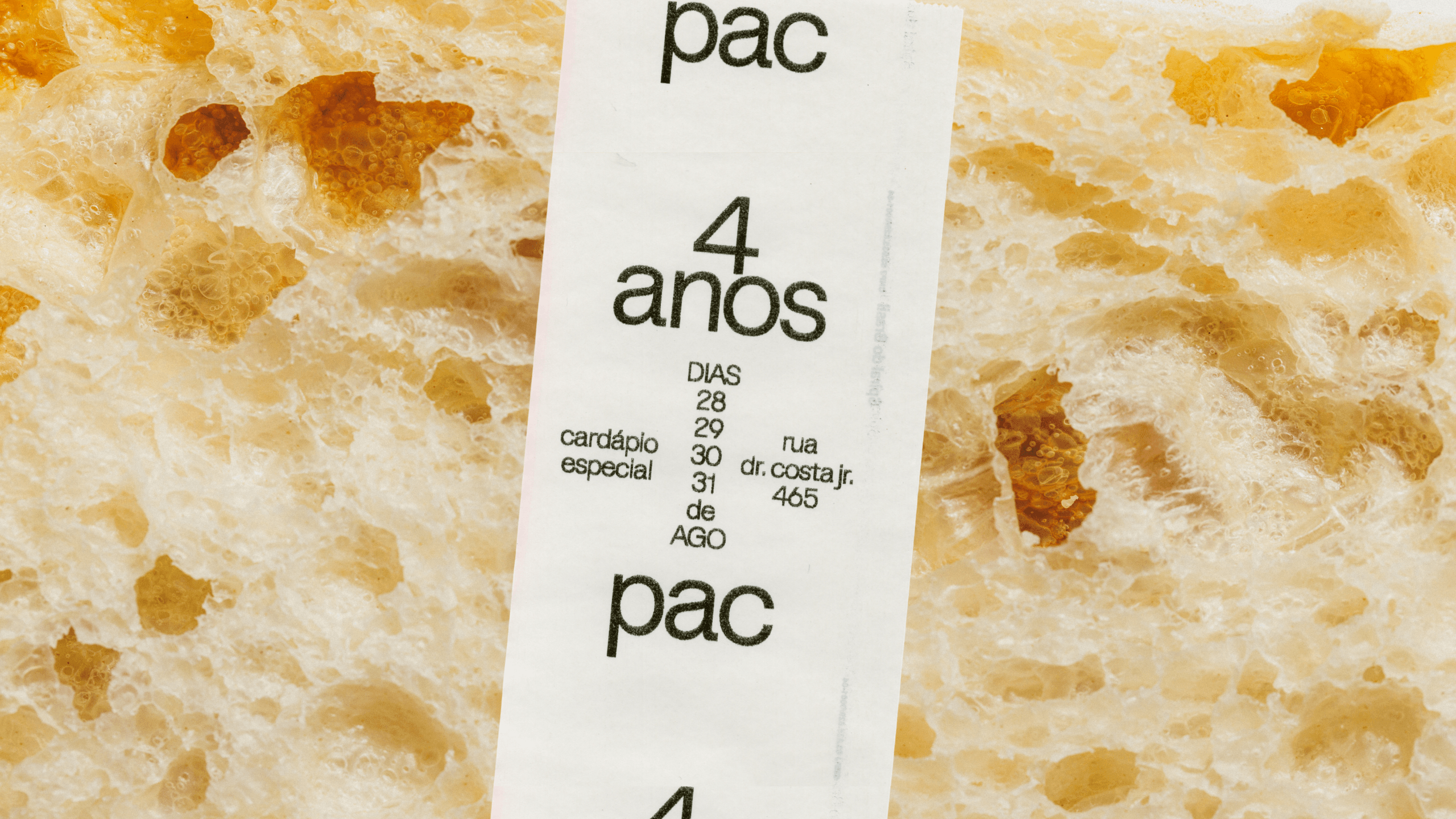
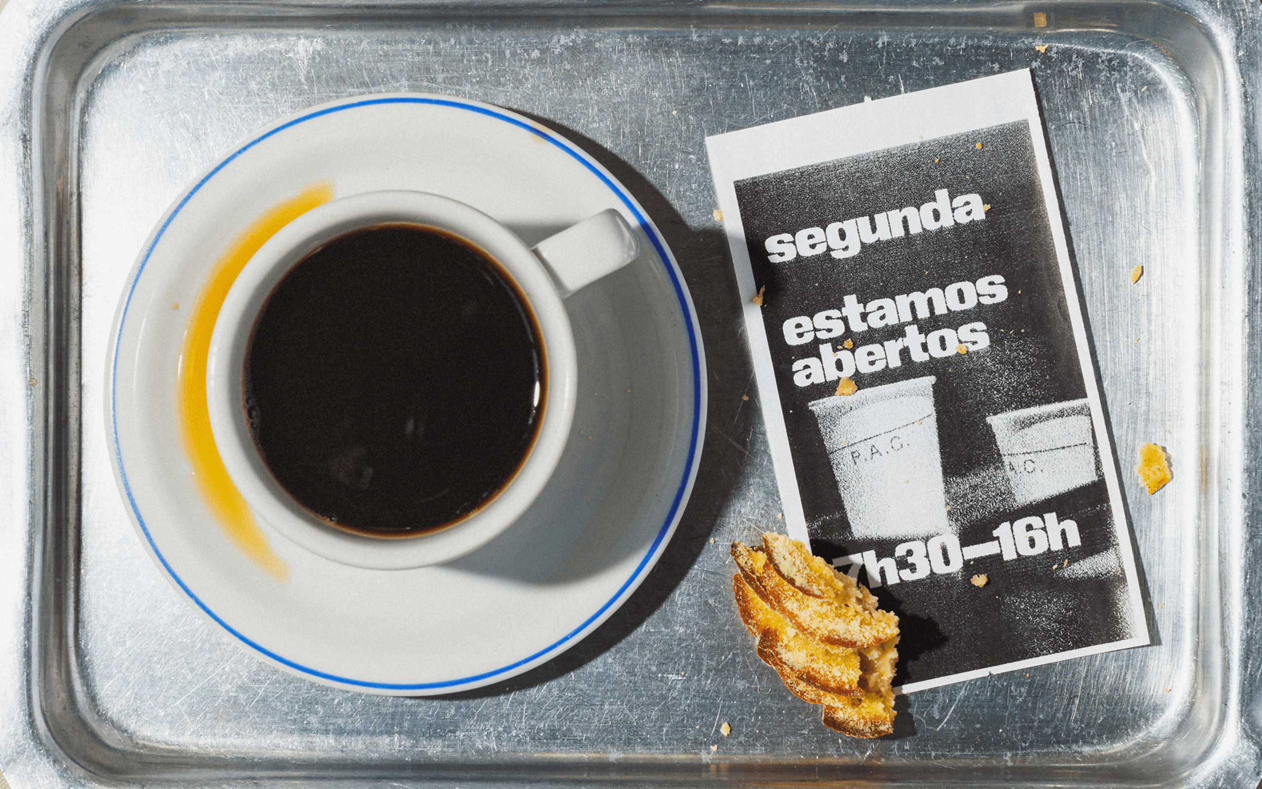
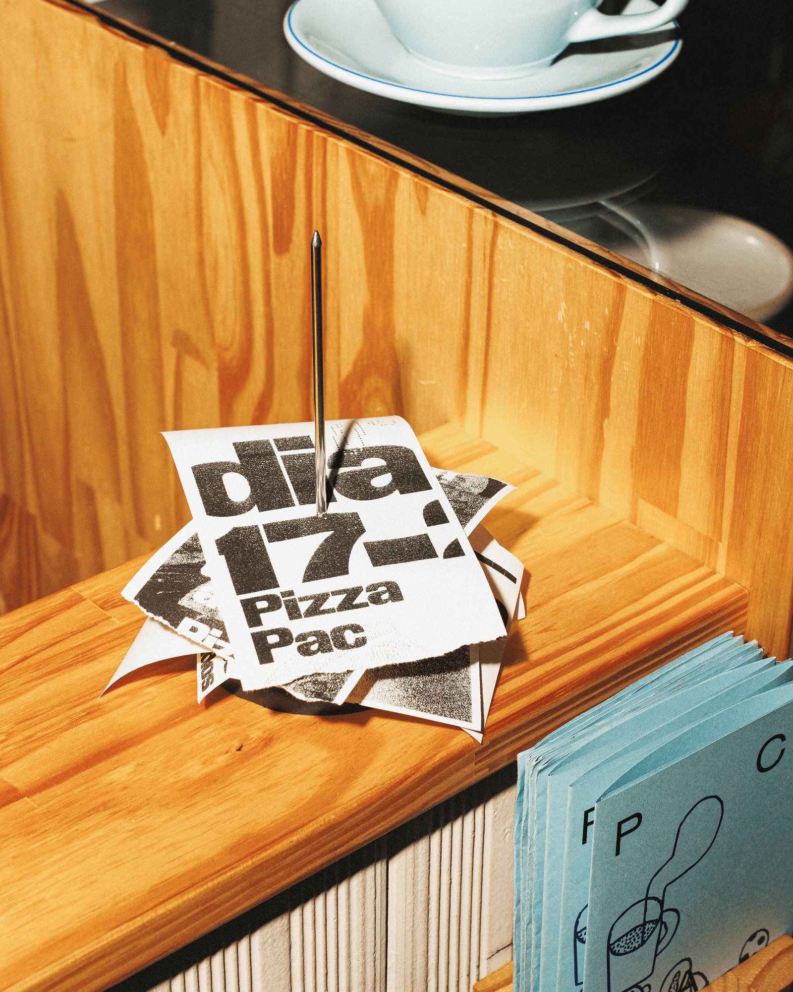
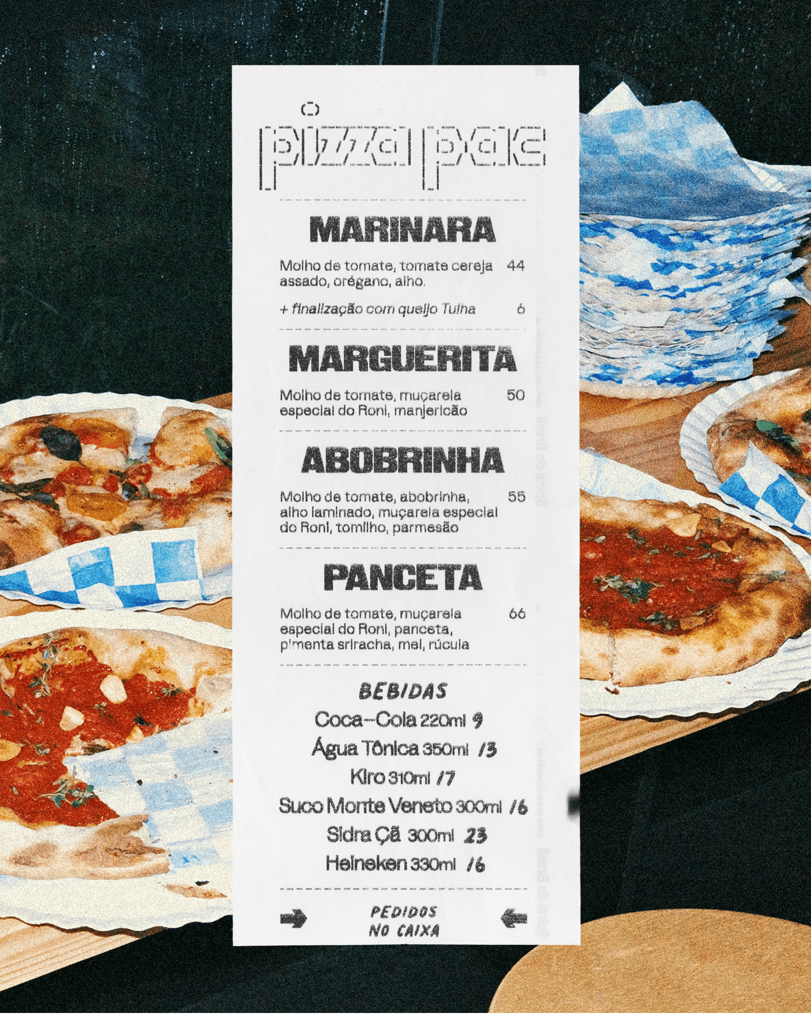
One of the most interesting examples came from the bakery's receipt printer. Instead of treating it as a production limitation, Polar turned it into a graphic tool. The special menus are printed on demand and last for a single weekend. Monochrome printing, the coarse resolution inherent to thermal printing, and the paper’s low opacity become part of the visual language.
Because these pieces are cheap, fast, and temporary, they also create space for looser work, open to chance, improvisation, and whatever visual impulses feel most urgent that week. Some pieces are carefully composed; others are deliberately strange, awkward, or almost illegible. The important thing is that they do not need to become a new rule.
Rather than treating the brand as a finished system, the project understands it as a working environment capable of responding to the bakery as it changes. The result is an identity that is less interested in consistency for its own sake and more interested in creating the conditions for new, quirky, and delicious things to happen.
Credits
POLAR TEAM
Creative Direction: Bruno Ribeiro, Ralph Mayer Design: Bruno Ribeiro, Miriam Kim, Ralph Mayer Illustration: Beatriz Batisteli, Miriam Moraes Motion Design: Ronaldo Arthur Vidal
CASE STUDY PRODUCTION
Creative Direction and Design: Bruno Ribeiro, Lais Ikoma, Ralph Mayer, Ronaldo Arthur Vidal Photography: Brejo
TYPEFACES
Gronland (Muhittin Güneş) KTF Rublena (Kyiv)
SCOPE
Art Direction Creative Direction Environmental Design Packaging Print Visual Identity